Wednesday 22 January 2014

Rowan Knitting and Crochet Magazine Issue 55: A Review, Part 2

Let's look at the second half of the patterns from Rowan Knitting and Crochet Magazine's Issue 55, since we looked at the first half of its patterns on Monday.


The Wharf design. I rather like this smart, casual sweater. If you don't care to show any midriff or this is too fitted for you, it could be easily made a little longer and looser.


Not a fan of the Boardwalk design, which seems better suited to a little girl or a Muppet than a grown woman. Nothing against little girls or Muppets, you understand.


The Sailor design is another smart casual look. And it's well-styled here. A cute striped skirt like this one combined with this top will make the perfect easy, wearable summer outfit.


Very much like the Celeste design. The stripes are fresh and cute and fun in an adult fashion rather than in a Muppet-appropriate way. NOT MUPPET-IST.


The Buoy design. This is pretty run-of-the-mill design, adequate and wearable without being notable in any way.


Not crazy about the juxtaposition of the stripes and lace in the Port design — they're just not working together as they should. I'd make that waistband plain stockinette in the main colour.


The Surf design is another Muppet-suitable look. I'm being too hard on this one, probably, because maybe a lot of people would think it cute and fun, but those ripple patterns always look too afghan-like to me.


The Cove design. Hmm, a striped t-shirt with a peplum. I'm surprised to find myself typing that I actually kind of like this one. It is a very young woman's style, but I can see it looking cute on a teenager or early twentysomething.


The Sally design is another cute striped number that a grown up can wear. I wish designers would work with vertical stripes more often. They are just as sharp and so much more flattering than horizontal stripes.


The Driftwood pattern. Rowan has really gone to town on stripes in this issue. This one isn't bad, but I would fix the dropped shoulders, make it long enough to cover my stomach, and go with another colourway. This one looks just too Christmassy for a cotton sweater. Unless of course you live in Australia where it's warm at Christmas.


The Pier design. This is another cute little top. Again, if you wouldn't be comfortable in something this short and fitted, it can always be made longer and wider.


The Promenade design. SO MANY STRIPES. The stripes are done in an interesting way and the sweater is well-shaped, at least, so that the overall look is good.


The Gift design. This one isn't bad, though I think it does call out for some tweaking. I'd fix the dropped shoulder and put a bit of ribbing along the bottom of the body. The hem here doesn't look finished.


The Divinity design is a rather nice, simple little top.


The Sierra Wrap. Not a fan of this, which looks a little rough and ready and awkward in shape.


The Chiquitta design. This is afghan-like and very unflattering (admittedly, those two qualities do tend to go hand-in-glove in knitwear). It's never a good sign when the model is shown from a angle rather than full frontal.


The Shore pattern. Another very decent striped pullover.


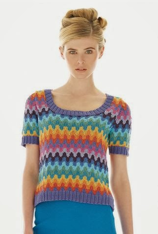
The Azerbaijan design. I knew this was a Kaffe Fassett as soon as I looked at. As always Fassett's colourwork is distinctive and masterful, but his shaping can be difficult to carry off. If I were making this for an intended wearer who does not have a model-type figure, I'd reshape the item to be standard fit with a cap sleeve.


The Belarus design. The colourwork here is GORGEOUS, but I'd be doing some reshaping of the body of this cardigan, which looks too big and unstructured to flatter most wearers.


The Estonia design. Another Kaffe Fassett design. This one is actually quite well shaped, though you might wish to make it longer and looser than it appears here.


The Latvia design. The only change I'd make to this one would be to make it in some non-pastel colourway, but that's personal preference rather than because there's anything wrong with this palette.


The Lithuania design. This one's sharp and wearable. Though I would not put it with those pants.


The Slovenia design. Love this one as is, although it does appear to be a little long for this (probably tall) model. That's easily remedied, though.


The Moldova design. I see even Kaffe Fassett has climbed aboard the stripe train. Not bad, but I would neaten up the fit and shorten those sleeves a little. That just above the elbow length tends to look dowdy, particularly when it's loose fitting.


The Adella design looks like an afghan with sleeves. It's all bunchy in the back and none too flattering in the front. Afghans really only belong on couches.

Monday 20 January 2014

Rowan Knitting and Crochet Magazine 55: A Review, Part 1

Rowan Knitting and Crochet Magazine Issue 55 is out. Let's have a look at the first half of the patterns today and the second half on Wednesday.


The Praise design. The lace is very pretty and I like the subtle colour shading, but the overall lines of this item bring the expression "sadsack" to mind. I'd neaten up the shaping if I were making this.


The Mercy design. Hmm, a drape front cardi. It's not a bad thing of its kind. I can't wear this kind of unstructured design myself, so I have a bias against it, but it is the kind of thing that can look attractive on and be useful to the right person.


The Hope design. I rather like this one, which with its lacy texture and slightly contrasting arm, neck and waistbands, manages to be more interesting than you would expect of something the colour of oatmeal. But I would not pair it with a gathered skirt, which as you can see here is conspiring with the waistband to do no good even to this professional model.


The Trinity design. A lace poncho with... a train. Or whatever all that excess knitting at the back is. The only reason this looks vaguely attractive is that it's Kidsilk Haze, which always looks luscious, and the lace pattern is lovely. But the shaping is ridiculous.


The Genesis design. I rather like this one, which could be a pretty summer cover-up and a nice alternative to a shawl.


The Prudence design. Cute and pretty little top.


The Rhapsody design. Don't care for this one. The hourglass shape on the front isn't a bad concept, but the execution just looks crude, as though it were a mistake.


The Bliss design. Very pretty lace scarf.


The Harmony design. I'm not enthusiastic about this one. Well, it's crocheted (and I am hardly ever enthusiastic about crochet), but aside from that I don't care for the tiered look. This isn't flattering and will make whoever wears it look like a lampshade.


The Loudres design. Love the delicate charm of this one.


The Deva design. Beautiful lace, beautiful yarn... but this is another sack-like design. Even lovely lace like this needs to be shaped like a garment rather than a bag.


The Madonna design. Dropped shoulders, horizontal stripes and tunic shaping add up to one unflattering sweater. Which is a shame, because the texture in those stripes really is something special.


The Promise design is really lovely except for that butt sling shaping in the back. I would so omit that.


The Julieta design. This is a Kaffe Fassett piece, and though the colourwork is as lovely as his always is... the shaping isn't great, and the combination of horizontal lines with this shaping isn't a well-advised one. Note that Rowan didn't use a full frontal photograph of this piece. I'd be inclined to use this design's masterfully subtle striped colour for another pattern altogether.


The Filippe design. This is basic but adequate design. The lines are good and the colours chosen work together well.


The Dia design. This is one of those designs that didn't get where it deserved to go. The patterned yoke and texture used throughout the body are interesting and attractive, but the dropped shoulders, boxy shape, and unfinsihed-looking hem are really detracting. Fix the dropped shoulders, add waist-shaping and a ribbed waistband to the body, and you'll really have something.


The Eldora design. This is attractive and interesting, but I would want to neaten up the shape and fit a little bit.


The Alma design. This is an offbeat colourway and texture that I think actually really works, but again I would tidy up the shape and fit. See how big that armhole is on the left? Everyone is going to have an excellent sideshow view of the wearer's bra and more.


The Crista design. Not wild about the texture on this one. It looks too much like the wrong side of an elasticized material. And this is a design that's doing even this lovely model no favours.


The Estefan design. Not thrilled with the colourway here, but I think the design would be fairly effective in, say, black, charcoal and light gray.


The Fernando design. This is actually pretty gorgeous, though I'm not sure too many of the men of my acquaintance would care to wear it. If you're making this for a man (and you aren't the man it's for), I'd get his approval first.


The Esperanza design. Rowan really seems to have thing for horizontal stripes all of sudden. This pattern doesn't look too bad here on a professional model, but it will be about as flattering as an awning on most women.


The Madia design. Oh man. A lot of sweaters are unflattering while being quite lovely articles in themselves, but this is not one of those sweaters. It's cropped and boxy with cropped sleeves that create a most unkind horizontal line, and the texture is horrible, as though the sweater were infested with worms. Let's just move along quickly and pretend this never happened as best we can.


The Guido design. Quite like this one, which takes the man's striped sweater to a new level with its subtle colourway and gradient effect.

Friday 17 January 2014

Mod Style

A reader of KNDD (this site's mouthful of a name really cries out for a handy abbreviation, so when another reader used this one on the site's Facebook page last month I decided to go with it) recently emailed me commenting that I tend to advise readers to "fix dropped shoulders" in my reviews and asking if I could point her to some instructions on how to do that. I couldn't find any such tutorial in a very quick Google search, and it occurred to me that since I am so given to blithely suggesting modifications to knitting patterns, some of the less experienced knitters out there might appreciate some advice on how they're done. So here are some tips on my two most commonly suggested mods: raising dropped shoulders, and adding waist shaping.

Standard fitting shoulders are almost always the best choice in sweater design. I don't know why so many designers go with a dropped shoulder, with the sleeve and shoulder meeting halfway down the arm. My best guess is that they use it because it's easy to design and easy to knit, but it's so terribly unflattering on most women, and tends to look sloppy even on men and children. Children and men can get away with it, but then children's clothing looks best in a loose fit, and men like looking like quarterbackers. Waist shaping is another mod that makes a lot of difference in how a women's sweater flatters her. I won't go so far as to say it's always advisable for every sweater and every figure, but a little waist definition does seem to be a good idea for most women's sweaters.


Here's a picture of a 1980s era Fair Isle pullover that has a dropped shoulder and does not have waist shaping. And it's a beautiful piece of work, but I can't help mentally reshaping it. Wouldn't it look so much more flattering and polished if the shoulder seams were at the shoulder, if the body was less generously wide and the waist curved in a little, and it weren't belling out over the ribbing at the hipline? Fortunately we at least don't usually see that extra bulk above the ribbing these days.


Now let's look at the nuts and bolts of how a sweater is shaped. The two diagrams on the left are how the Fair Isle sweater shown above might look in diagram, and the two diagrams on the right are for a sweater with the standard fit shoulder and waist shaping I recommend for most women's sweaters. (That is, if the diagrams were the scratchings of a hen that had just walked through ink. Excuse the crudeness of the diagrams. I don't have any software for creating design diagrams and probably wouldn't know how to use it if I did, so I just did them by hand and scanned them in. Believe it or not, this is actually the best of about ten attempts.)

Let's talk about waist shaping first, since it's the easiest thing to do. These directions will work on a most women's sweaters that don't already have waist shaping. The aim is to have a bit of gentle, subtle shaping rather than a fitted waist, but while you'll barely notice the difference in how the sweater feels when worn, I think you'll find that it makes a distinct difference in how it looks.

If the pattern you wish to make has no waist shaping in the directions, begin knitting the back or front of your sweater as your pattern directs, and continue until the piece measures 3" or 7.5cm from the beginning. On the next row, knit one stitch, knit two stitches together, knit to the last three stitches, then knit two stitches together and knit one stitch. If your sweater pattern requires you to purl this row or these stitches, use purl stitches to decrease, or you might like to move the decrease stitches over by a stitch or two. Experiment a little with different ways of decreasing and the position of the decreases, and work your decreases in whatever method best blends into your pattern and looks the least obtrusive.

For a sweater in DK yarn, repeat this decline row once every 1"/2.5cm three times more. At this point the sweater piece should be approximately 6"/15.25cm long and its width will have been decreased by about 1"/2.5cm on each side of the sweater. For a sweater knitted in a finer or heavier weight yarn than DK, you'll need to work the decreases either more or less often in order to taper the sweater in by that 1"/2.5cm within that second 3"/7.5cm of knitting. Do the math as to how many stitches you need to decrease 1"/7.5cm on each side, and how many rows apart they should be in order to get them done by the time your knitting measures a total of 6"/15.25cm or a little more from the beginning.

Once all these decreases have been worked, knit even until your back or front piece measures 8"/20cm from the beginning. Then begin to widen the sweater again by working an increase row: knit one, increase one in the next stitch, knit to the last two stitches, increase one stitch in the second last stitch, knit one. Work this increase row as many times as you worked the decrease row and with the same number of rows spaced between them until you've reached your original number of stitches. Add this waist shaping to both front and back pieces in exactly the same manner so that they will match.

Now let's talk about fixing dropped shoulders. Dropped shoulder styles generally have no decreases at the armhole, as in the case of the diagram on the left above. You'll need to add these armhole decreases to the back and front of your sweater to make the sweater the right width at the shoulders. I suggest that you refer to diagrams and instructions from another knitting pattern that does have shaped armholes and use them as your guide. I have one particular all-time favourite sweater pattern that's just the right shaping for me (I've made it twice as is because it's so very flattering) and I usually refer to its diagrams whenever I want to reshape a sweater. Alternatively, if you have an existing sweater that fits just right at the shoulders, measure the width of the sweater at the shoulders and calculate the number of stitches you'll need to decrease from the width through the body of the sweater you are making to get that ideal shoulder width.

Once the back and front are taken care of, you'll then need to adjust the sleeves to fit. As you can see from the two sleeve diagrams above, there's a big difference in how they're shaped. You will need to be make the sleeves longer than your original pattern says in order to compensate for the fact that the shoulder will no longer extend down the arm, and you will also want to shape the cap of the sleeve to fit the shaped armhole. If you used another sweater pattern's diagrams as your guide for the armhole decreases and shoulder width, then you should also use that pattern's sleeve diagram and measurements to get the right specifications for your sweater's sleeve length and cap shaping. If you took your measurements from a finished sweater, measure that sweater's sleeve and shape your project's sleeve in the same way.

While you're doing all this reshaping, you'll also have to watch out for any colourwork or stitchwork that you're displacing/removing and make sure that the patterning still lines up the way it should. Some elaborately patterned sweaters, such as picture knits, may not lend themselves to reshaping because you'll have to cut out a crucial part of the picture, but usually you'll find a way to do it.

I hope these tips are of use. I found this post difficult to write because although I wanted to give very clear instructions as to how to shape a waist and fix a dropped shoulder, there are so many possible variables in yarn weight and sweater sizes that it seemed to me that more specific instructions would be of very limited use, and might even lead some knitters astray. Making your own mods always means that you must wing it a little. Make your calculations based on the stitch gauge for your particular project, the measurements of the wearer, and the measurements of the desired garment in order to figure out just how your waist, armholes and sleeves should be shaped.

Happy modifying, and may your project fit and flatter when you're done tinkering.