Monday, 5 October 2015
Knitter's Magazine 120: A Review
Knitter's Magazine has released issue 120. Let's have a look at it, shall we?
Bias Blues. This looks more ragged than stylish. It reminds me of the dress Cindarella's woodland friends made for her... after her stepsisters had torn it to pieces.
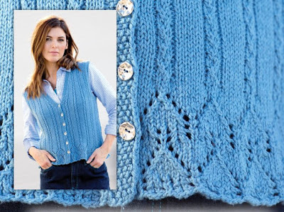
Taura. Not a bad little vest, though it could do with some waist shaping and perhaps a little more length.
Texture at Play. Interesting texture, and the shaping isn't bad, though again it could do with some waist shaping.
Sunshine at Sea. After staring at this design for some minutes, I surprised myself by liking this one. The unusual yarn choice and stitchwork give it a lot of visual interest, and the cowl neck gives it a certain style. I would make it a bit more flattering and wearable by neatening up the fit a bit, adding waist shaping, and adding more toggles or buttons to the front.
Rustic Zen. Did they take this one off a cattle rustler or sheep stealer? I could imagine people engaged in such lines of work need a lot of freedom of movement, but most contemporary women aren't being pursued by bounty hunters, don't need their clothes to be so loose fitting, and can afford to care about whether a piece is flattering or not. I'd like to see this design translated into a piece with a flattering, wearable shape.
Agate Ripples. Quite like this striped kimono. This could have looked very afghan-ish, but the design combines stripes and ripples so cleverly that it elevates it above couch wear.
Not Quite Nautical. Very much like this African textile-inspired piece too, which is a sharp and striking piece of design.
Carved Kiwi. This is rather a nice textured pullover, but all I can think when I look at this is how much I am lusting after that turquoise-flecked green yarn.
Hatchmarks. Very sharp and sophisticated hat and cowl set.
Peak and Valley Skirt. This piece looks like it came straight off an old landscape couch in someone's musty basement.
Double Take. The colourwork and yarns used here are gorgeous, but I don't know about the shape of this piece. It lies so well, but that bottom edge looks so awkward and abbreviated, as though there should be more of the design. I'd like there to be more of this shawl or scarf.
Shawl Strategy. Very pretty and simple eyelet shawl.
Blue Phoenix. Very attractive, and the description promises that it will lay on the wearer's body much like a cardigan thanks to its shoulder and neck shaping.
Uppercut X2. Nice minimal sort of piece. The tunic length won't be for everyone (i.e., it will work much better on tall women than short ones), but it can be easily shortened if that's what the wearer wishes.
Uppercut X2. This kind of trapeze-shaped knit will look dowdy on most women. Even this model isn't able to carry it off.
Hill Country Cables. I rather like the fleece-backed scarf with pockets, which seems a rather handsome and practical piece to me, but I can't with the boot toppers, much less the little pom poms attached to it.
Woodland Patches. I think I might actually like this one if it were in a decent colourway, but the colour combination they've used here is so searingly awful that it's effectively blinded me to the vest's good qualities.
Subscribe to:
Post Comments (Atom)


No comments:
Post a Comment