Wednesday, 13 July 2016
Knitter's Magazine 123: A Review
Knitter's Magazine has released issue 123. Let's have a look at it, shall we?
Lady in Red. I like the top, but the skirt looks like a costume from a modern dance exploration of the issue of urban poverty. In the description, the skirt is described as a "car wash skirt", which is more apt than any joke I could make.
Golden Patinas. Interesting and attractive stitchwork.
Mint Cooler. The lace is pretty, but the piece is so Dorothy Zbornak.
Knit, Knot, Net. Love the stitchwork in this throw. It feels both contemporary and timeless.
Crescent & Arch, version 1. Attractive shawl.
Crescent & Arch, version 2. The yarn used in this version is fabulous.
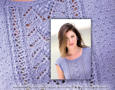
Buds & Wings. I wish we could see the top as a whole. I do like the stitchwork, but am not thrilled with the look of the edges of the cap sleeves, and the description says this piece has a "hi-low split hemline in seed stitch", which probably means it has a mullet hem.
Caribbean Blocks. This shawl has an interesting construction, but though I like the yarn used here, I don't know if it was the right choice for this project. The pooling seems a little much when it's employed in combination with the checkerboard effect of the stitchwork and the stairstep edges. I'd like to see this done in a solid colour with perhaps some sharp stripes in an accent colour or two along the lace border.
Morning Mist. Pretty, and I like the denim-like look of the yarn.
Twist & Torque, pullover & skirt. The shaping is good, and that ripple effect is fantastic, but I would like to see this in a happier colour.
Twist & Torque, cardigan vest. I'm a hard sell on asymmetrical pieces, but this one sits so perfectly and is so interesting it's like a piece of wearable art.
Twist of Lime. I wish I could see this better. From what I can see, though this is an interesting direction for knitwear design, I don't think the result is quite working, either in its colourway, its shaping, or its details.
Bells & Pulls. Some attractive detailing on this one.
A Maze 'N Miters. Interesting construction. I think this one needed a more united colourway to make it work.
Salted Caramel. This one needed some more colour -- in fact, any colour -- as it is so blah.
Diamond-T. Classic diamond pattern short-sleeved pullover.
Subscribe to:
Post Comments (Atom)


I think it was Maggie Righetti who said, years ago, that if you can't see the details in the photo of a knitted project, it's because there's a design flaw there that the stylist is attempting to hide. I can't imagine spending the money for the yarn and the time to work up a project if the designer / magazine isn't going to show me what I'm getting myself into. (Same reason I don't do mystery KALs.) There are a couple of projects in the issue that I might conceivably do, but I don't yearn for them strongly enough to lay out the bucks for the magazine. For years, they have been tilting to the "weird" at the expense of the wearable. Looks like very little has changed.
ReplyDelete