Monday, 24 June 2019
Knitty First Fall 2019: A Review
Knitty has released its First Fall 2019 issue. Let's have a look at it, shall we?
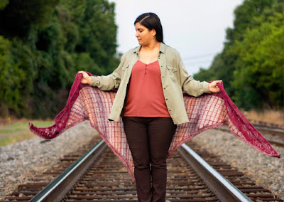
Collanne. This wrap makes for an attractive, casual look, and it would be a fun design to pick a colour scheme for.
Banrion. This wrap has the look of a classic Breton sweater combined with ship cables, and I'm here for it. Very nautical.
Last Night I Dreamt. Classic cabled cap, and it's reversible, which is always a nice plus.
Mrs. Rabbit's Muffatees. This cowl and mitts set, which have an interesting slipped stitch texture, were inspired by Beatrix Potter's work. Even if you don't think you'll ever happen to make this set, do check out the pattern page, which features a lovely little biographical essay about Potter, and is illustrated with some charming watercolour sketches.
Brenton Point. This is an interesting new take on the fair isle yoke sweater, and it has a certain fresh, contemporary feel to it. I think it's the combination of the solid background colour on the yoke, which gives the yoke a cowl-like look, the use of simple diamonds in the yoke, and the minimal detailing in the body of the sweater. The shaping is good too.
Promenade. This is quite eighties in its design, although the subdued colourway is contemporary. It's fun in its way, but I would fix those dropped shoulders.
Fugi Rib. I like these so much that I've added them to the sock patterns I've got saved as favourites on Ravelry and hope to get to in 2020.
Don't You Want Me. This one is definitely very 1980s, and of course the name of the pattern very specifically references the 1980s (and has given me a wicked earworm). They're fun, and the perfect thing to wear when you want to imagine you're dancing under a strobe light in a 1980s-era dance club.
Bremen Town Bag. Oh, this is a fun design that makes me smile. Yay for clever, plucky animals who band together, outwit a group of robbers, and make a happy, comfortable life for themselves after their heartless owners kick them out on the street for being too old. I can't help wishing the top edge was finished a little more nicely and/or had a flap, though.
Ozzie the Opossum. I'm trying to get past my utter repulsion for opossums here and assess this design fairly, so I'll just say this design is really well done and makes a horrifying species of rodent look cute and cuddly and now I'm going to go do something else as quickly as possible to get my mind off the mere existence of opossums.
Labels:
Knitty,
magazine reviews
Subscribe to:
Post Comments (Atom)


Opossums are not rodents but are marsupials. One of the positive things about them is that they eat ticks--which are truly a horrifying species.
ReplyDelete