
Rowan is celebrating their 40th anniversary with a special collection of 40 patterns drawn from their archives. I've only been reviewing their patterns for six of those years, so I've reviewed their anniversary edition though it means I've reviewed some of the designs for the second time. Just for the fun of it, I've linked back to my original assessment of the designs from 2012 on, and talked about whether I stand by my words or not. When I began work on this review, I was expecting that Rowan would truly have gone back over the past 40 years and provided a cross-section of patterns from all four decades. But that's not what they did. Most of these designs seem to be from the past twenty years, with just one dating from 1990. It felt a bit like going to a modern history museum and finding out that half of the exhibits were closed. But I understand why the Rowan editors did it. Fashion hasn't changed very much over the last twenty years and it is easy to select designs from the last two decades that look current and attractive by 2018 standards, while designs from the previous twenty would require some serious tweaking to make them usable, and a lot of knitters don't care to do that much work, especially when they are paying for a newly published pattern.

Onza. This is a pattern from 2000. It's so simple and classic I doubt it will ever look out of date.

Anice Shawl. This wrap design seems to be from 2009. A shawl this beautiful will definitely never go out of fashion.

Winter Flower. Here's another design from 2000. I like the understated floral theme, the shape is good, and it would be fun to pick out a colourway for this one.

Orkney. This cardigan is from 2012. I reviewed this one when it came out in 2012, said I liked it overall, and complained about how the neckline and bottom edges were sagging open. It's true that the way the sweater sat on the model in the original product shot did the design no favours. It sits quite well here.

Carlotta. From 2004. At first glance I guessed this pattern to be from the early 1980s, and I suppose without the beading and the ribbon it might have been, but those bits of bling make for a more recent look. It's pretty, but I might very well decide to do without the ribbon and the beading if I were making this. The rose detail is pretty enough for me.

Striven. From 2007. Rather a nice piece. I like the subtle and sophisticated plaid.

Plaid Coat. I don't know when this design was originally published as it doesn't appear to be on Ravelry. It actually looks better in the original photo than it does in this one, as the model in the first one lets it hang free. I like the collar and cuffs detail, but I can't help wishing it had a little bit of shaping to make it look less bulky.

Evia. From 2002. It's amazing how much that bottom contrast panel does for what is otherwise a very traditional pattern. Really freshens it up and turns it into something different.

Agnes. From 2004. The French knots really make this one work.

Soumak Scarf Wrap. From 2013. When I reviewed this one the first time, I wrote, "The Soumak Scarf Wrap is really very striking, if you're the type of person who can carry off a dramatic wrap like this (and can stand to do the constant adjustments). If you're not that person but love the design, buy twice as much yarn as specified in the pattern and make a beautiful afghan." Fair enough, I think. There is some great texture in this.

Addison. From 2012. In my 2012 review, I wrote: "I wouldn't normally have included a sweater as generic as this, but I did want to point out the things that set this sweater apart: the texture, raglan sleeves, funnel neck, and easy but not sloppy fit. The care that's been taken in construction gives this basic design a very finished look. Knit this sweater in your favourite colour and you'll get more wear and real pleasure out of it than three or four intricately patterned and eye-catching sweaters." Back when I first started blogging I didn't do all the patterns in each magazine review the way I do now. I still think this is a very decent plain sweater design. And that it deserves a more attractive colour.

Tillie. From 1999. So pretty.

Plain Cellini. I don't know when this one was published, as there doesn't seem to be a Ravelry page for it. It strikes me as one of those designs that will look frumpy on most women. Even this professional model can't quite make it work.

Guiseley. From 2009. Rather a nice piece with good texture that would add quite a lot of interest (and warmth) to a simple outfit.

Bressay Hap Shawl. From 2007. This works better than I ever would have thought an afghan-style wrap ever could, but it still looks much more like the former than the latter.

Wayfarer. From 2010. Useful and attractive wrap.

Fickle. From 1991. And this design is very 1991, as it offers both the oversized and the cropped fits that were in style then. I don't know why it never occurred to us to aim for a happy medium in those days. I like the overall design of both sweaters, but would reshape them to a standard fit with waist shaping.

Valentina. From 2010. There's no denying that this is rather fabulous. It's one of those designs that you couldn't help noticing if you saw it on someone in the street.

Powder Puff Pullover. From 2003. Cute, fun look. I would neaten up the fit a bit, and I also like the idea I see in one of the Ravelry user photos I see on this pattern's Ravelry page: that of adding a narrow band of colour to the neckline, cuffs and hemline.

Kintyre. From 2012. I wrote that it was a "beautiful pullover". And I stand by that daring and controversial stance.

Brocade. From 2005. Gorgeous. I've had my eye on this design for quite some time myself.

Robinia. From 2011. Love the floral motif, but can't help thinking I'd reshape this to a more standard fit. But I must admit this design looks well on the Ravelry users who have knitted it as is.
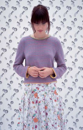
Flora. From 2004. This is rather cute. The edgings and the good shaping turn what would be a basic little striped sweater into something pretty.

Burghley. From 2009. A handsome piece.

Lidiya. From 2010. The Fair Isle pattern is terrific (it is after all a Kaffe Fassett design), but I'd reshape. I see from the Ravelry user projects that many Rav users have done just that, using the Fair Isle pattern to make whatever kind of sweater they wanted, or legwarmers.

Celtic. From 2006. A very attractive and wearable jacket.

Flourish. From 2001. Pretty. This design is also shown in a short-sleeved version without the intarsia floral pattern, but I think it looks better with the floral motif.

Kirkwall Wrap. From 2012. Here's what I said in my first pass: "I like this wrap, but only theoretically. The theory being that it would only be worn while sitting on a couch and when feeling chilly." In six years of writing knitting design reviews, I've never really got past my conviction that while large scale wraps can look beautiful in professionally styled photos, they're cumbersome and impractical in real life. I don't see many women wearing them in the street at all.

Mist. From 1999. This one's a little too minimalist for me personally, but I must admit that it's wearable and it looks well on all the Ravelry users who have made it.

Dhurrie. From 2013. Here's what I said about this design: "I wish I could see what's really going on with the Dhurrie design. It looks like it's essentially a cape with a matching scarf worn over top. I'm not crazy about that concept. Capes can be unflattering as it is; adding another bulky element to it is not going to improve matters. If you want to make this set for yourself, I'd suggest you wear them separately." Turns out the cape and the scarf are attached. I'm still not sold on the concept of a scarf/cape merger.

Franziska. From 2014. Here's my 2014 review of it: "I can't get behind (or more to the point, into) the very oversized sweater thing. They're unflattering for most women and they catch on things and generally look sloppy. The overall design of this is quite attractive, but if I were to make this I'd make it a standard fit and raise those dropped shoulders." Present day me agrees with 2014 me.

Martha. From 2000. A wearable, classic piece.

Rapunzel. From 2003, and this looks so very 2003 to me, because empire-waisted everything was having a real moment at the time. It still looks current, and the stitchwork is fantastic.

Flora MacDonald. From 2001. I love the bright stripes and the tartan band, but I don't love the cropped, boxy shape.

Restful. From 2010. This is one of those pieces that have such a relaxed elegance to them.

Monty. I don't know when this pattern dates from, as there doesn't seem to be a Ravelry page for it. It's so oversized and shapeless the model is having quite the time trying to make it look stylish.

Wentworth. From 2009. A pretty and mood-boosting striped cardigan.

Game Board Cardigan. From 2000. Love the yarns used here and the checkerboard pattern, which work so incredibly well together, but not the shaping.

Snowberry. This is another pattern I can't find on Ravelry, so I don't know when it was originally published. It's very pretty. I love the floral pattern and the picot edging, and the shaping is good too.

Olive. From 1999. Quite attractive and smart.
I think the Valentina looks like a bathrobe. I know you are not a fan of oversized fit, which I do like, but Franziska and a couple of the others are too much for even me!
ReplyDeleteThanks so much for giving us a good solid look at this collection - always value your opinion.
ReplyDelete