Thursday, 29 December 2016
Vogue Knitting Winter 2016/2017 Issue: A Review
Vogue Knitting has released its Winter 2016/2017 issue. Let's have a look at it, shall we?
Pattern #1. Some beautiful stitchwork on this, and good shaping. I'm not usually a fan of asymmetry, but this one's got a certain balance and restraint to it that makes it effective.
Pattern #2. Some beautiful stitchwork in this one as well, but the hourglass effect is too exaggerated and the neckline isn't flattering -- or even comfortable-looking.
Pattern #3. I would have made this a touch neater-fitting.
Pattern #4. I would make this one a lot neater fitting, as it's more than a little tent-like.
Pattern #5. Some quite effective use of cable here.
Pattern #6. Nice piece, though I think the two cables could have been better handled at the top, where they merge into the collar.
Pattern #7. Oooh, this one is beautifully flattering and elegantly relaxed, and looks delightful to wear.
Pattern #8. This one looks like it was designed by four different people. Who were all drunk. It's a mishmash of yarn shades and flourishes that don't work together. And for some reason it's the cover design, though it's the worst design in the whole issue.
Pattern #9. This one will see its wearer all the way through her pregnancies and make a wonderful pup tent for her children to play in.
Pattern #10. This sweater is quite dramatic and even flattering here, though I have my suspicions that the model's thumb deserves most of the credit for the way the right side is conforming to the line of the model's upper body and that this sweater might not look nearly so good in real life. I do love the chevron pattern and the colour blocking and think they should have gotten some better shaping.
Pattern #11. Not bad. This is the kind of sporty, casual sweater one can wear with track pants.
Pattern #12. The modern fair isle pattern is rather striking, but I would make this piece in a relaxed fit rather than huge.
Pattern #13. I think I would have gone with two different contrast colours for the lines rather than just one. Using the main colour makes the effect a bit wonky, visually.
Pattern #14. I like the pattern overall, but my goodness is this piece enormous. Are oversized sweaters and tops back, and am I going to sound increasingly shrill and out of touch on this topic for the next little while?
Pattern #15. Very pretty. I'm liking the houndstooth pattern, the colours, and the shaping overall.
Pattern #16. Not a bad little wrap, but I don't think this colourway does much for it.
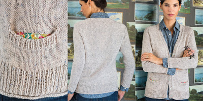
Pattern #17. I like this one the whole, but I'm scheming to get rid of those unsightly sleeve and shoulder seams. I think I would have designed this sweater to be knitted from the top down so that it would be seamless, though one would probably not be able to get a v-neck working that way. Also, this sweater deserved a better colour scheme.
Pattern #18. A very contemporary and attractive take on the argyle pattern.
Pattern #19. Love this hat. Both the pattern and the colour palette are perfection.
Pattern #20. A lovely cowl. The non-traditional colour combination serves the classic fair isle pattern well.
Pattern #21. A classic if rather basic cowl, with pockets that someone has inexplicably chosen to line with pieces of a granny apron. This pattern needed something, but it wasn't that.
Pattern #22. This is an inventive and contemporary piece, but I'd put it on a couch rather than on my back.
Subscribe to:
Comments (Atom)


