Showing posts with label Knitter's Magazine. Show all posts

Wednesday 20 November 2013

Knitter's Magazine Issue 113: A Review

Knitter's Magazine has released the preview for Issue 113. Let's have a look at it.


I'm not normally a friend of asymmetrical design or of zippers in knitwear, but I love the Diagonal Zip design. This jacket's asymmetry is balanced, with the two collars flowing along one line, and the front zipper looks right because it's echoed by the two cuff zippers. The texture and the overall lines are very good. I don't know how good this design will look worn open, but it looks so damn good zipped up, who cares. Excellent work!


We move from a great opener to.... the Chartered Lines design. Which is a cropped-length and top-buttoned style that even the model isn't carrying off, has a textured pattern added to an already very busy tutti frutti-coloured yarn, and is that fringe on the collar? It makes me wonder how the previous sweater got along with this one during the photo shoot, because they don't have much in common. I'm imagining a coolly aloof attitude on the one side and belligerence on the other.


The Shaded Diamonds design one isn't at all anything I would ever wear myself, but it's such a fine piece of design that I can only admire it. The mitred neck detail and the edgings have employed an variegated yarn to wonderful effect, and the lines are so good.


The Incline Wrap. Entrelac is another design element that can be problematic, because it adds such bulk, but again it's been made to work here, in this sleeveless wrap. Using entrelac in a design that's meant to be worn as an outer layer makes the bulkiness much less of a issue (eliminating the sleeves also helped), and this piece is well-shaped. It will work well over both short skirts and relatively fitted trousers.


The pleated waist section and the striped raglan detail in the Iron, Slate & Moss design are competing somewhat, making the pudding more than slightly over egged. I'd go with one of those elements, not both, with the pleating being section being my pick to eliminate as it won't flatter many waistlines. Finishing off the sweater with the dark blue ribbing that's been used at the neckline and cuffs would work well.


This Smoke & Ice design's... okay. It looks like one of those 1990s-era single pattern leaflet patterns that somehow came into your possession and that is too nice to weed out with the hopeless 1980s era leaflets, and yet is not nice enough to make.


This Rainbow Grove vest is a lovely piece of design. Well-endowed wearers and/or those without a waistline they want to emphasize will want to decrease the waistline ribbing to just an inch or two, and feature more of that gorgeous stitchwork.


The Confetti Design. I don't care for the smock-like shape here, which would make most women look dumpy. I'm afraid even to ask how long that back hem is — it continues beyond the limits of the picture. The yarn choice isn't helping. I can't even look at the picture of this sweater for very long before I start wondering if I'm hungover or something — and it's been months since I had a single alcoholic beverage.


The Tangerine Leaves design is quite a pretty little open front cardigan. A woman who owns this piece will get a lot of wear out of it, because it can be worn with many outfits and will always look polished and be warm and comfortable.


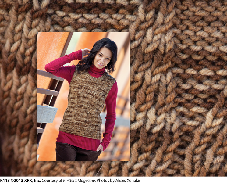
The Tilt vest is another attractive, useful, go-anywhere piece.


Not liking the Weather Ready design. It does have some good points, namely its cabled texture and collar, but the overall shape is just so sloppy and unflattering that the model can't even carry it off despite the bravest of smiles.


The Slip-up Mobius hat and scarf. This isn't appealing to me, but I think it's the fault of the yarn choice here, which I personally find more than a little eyeball-searing. If I imagine it sans pom pom and in a yarn colourway I actually like, it's a decent set.


The Garter Epaulettes design is a nice, simple piece, though I find it just a touch too simple. I'd maybe add cuff detailing that echoes the epaulettes to kick up the level of visual interest just a bit.


The Ladies Only cardigan is a good, polished-looking piece of work. The top-buttoned style really works here because it's so organic to the design.


The Unfinished Business design looks like it began life as a simple tank and decided it was born for high fashion, and so added random side draping, regretted it, couldn't figure out how to get back to the simple life that had really suited it much better, gave up on itself, partied too much and ran out of yarn, and is now bound for an ignominious death in some forlorn and filthy rooming house. Seriously, this is one nearly unwearable item that almost no women will be able to get away with wearing, and even then the question is why would they?


The Blues & Berries scarf isn't bad. I actually think it would have looked better with a basic denim jacket than with this "pull out all the stops" styling, but you have to give Knitter's Magazine credit for going the extra mile, even if that extra mile was beyond the finish line.


The Blues & Berries hat and scarf set (the scarf is the same design as the one above done in a second colourway) is really basic but wearable and presentable enough.


The Shifting Bands cardigan is a very competent piece of work. It's got enough interest to make an outfit, and yet not so much that it won't go with anything in a woman's closet or can't be worn often.


I don't even know what the Zigzag in Cables design is. I think it's supposed to be some kind of architecturally structured cowl or scarf, but it looks like a pile of swatches from the design studio have inexplicably gone rogue and are trying to throttle the model.


The Step-up Shawl isn't a bad piece. The choice of mitred squares is an interesting and visually distinctive one for a shawl. My response is rather tepid because of the colour scheme — this one is a little on the muddy side.


This is a second version of the Step-Up Shawl, and it confirms my theory about the colours dampening my enthusiasm for the first one. I love this version.


The Chevron vest isn't a bad piece of design at all, but all I can do is stare at that closing detail and think about how I really don't like it. I'd go with a simple silver clasp there, or at least a better-looking knitted loop.


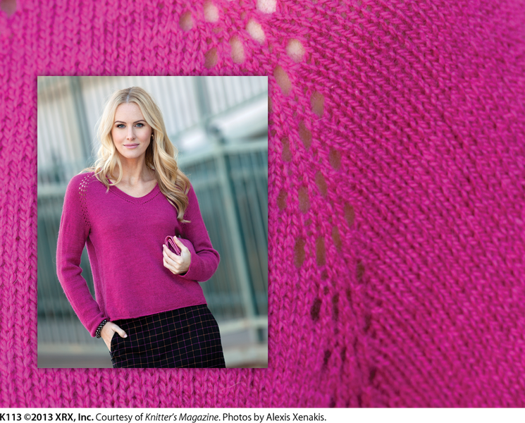
The Uncharted Lace pullover is another good wearable design. The touch of lace detailing at the raglan seams gives this simple, classic piece distinction.

Saturday 31 August 2013

Knitter's Magazine Issue 112: A Review

Knitter's Magazine has released issue no. 112. Let's have a look at it, shall we?


I'm not a poncho/capelet fan, and I don't like this colourway personally, but this Square Fare pattern isn't a bad design. It has some shaping and was made with care, which gives it some character.


This Diagonal Ribbons piece has a really interesting texture and I'd love to see what could be done with it if it were used in an actual design (something with, you know, shaping and finishing), instead of just being randomly whipped up and slung onto a model so that it hangs on her like a remnant torn from an old curtain. I don't speak against curtains, mind you. All I'm saying is that when Scarlett O'Hara made a dress out of curtains, she took the trouble to actually make a dress.


Ripple Ridge. I wish I could see the whole length of this top, but from what I can see this is an attractive, polished piece that can be worn with a suit or jeans.


Career Checks. This one is very Chanel-esque. I almost think I should add it to my post on Chanel-like sweaters. The loopy detailing down the front is rather unusual and not something I'd ordinarily like, but I think it works on this design and keeps it from being too staid and run-of-the-mill.


The All Ears hat isn't for every adult, but I have to admit it made me laugh (in a delighted rather than a sardonic way) and that that model's laugh also looks very much like one of genuine enjoyment. It's a playful, well-constructed design and could be fun on someone with the sense of fun and chutzpah to carry it off. Just don't go down to the woods in it during hunting season, because you'll be in for a big surprise.


This is the Eggplant Tunic, and I can't sign off on something that looks like a dreary pinafore that was named what it was because you can spill eggplant on it and not make it any worse-looking than it already is.


The Points on the Curve design is referred to in its description as a "fichu". This designer has gone for a modern fichu look, because this looks like nothing that would ever have been worn by say, the ladies of Cranford. I can see this working on a woman with a very modern dress sense.


I wish I could see the front of the Forest Hoodie as I'm not sure about how that front pocket will look dead on, or about the finishing on the front, but I think I like it. I can't help liking the tweedy elbow patches.


The Cirque Jacket is one of those designs that made a brave beginning but didn't get where it deserved to. I like the vertical bands on the front, I like the garter stitch, but those lapels and button fronts look just awful and I'm more than a little concerned about the shaping through the hips, which looks like it flares out too much and won't be at all flattering when viewed squarely from the front.


I like the Red Line sweater except for one thing, and you can probably already guess what that one thing is because, like me, it's all you see when you look at this photo. I know the zipper is supposed to be an accent, but it just isn't passing for one. It's just too nuts and bolts to be aesthetically pleasing, especially on an otherwise sharp and polished design. I'd omit the zipper, because this sweater can easily be pulled on over the head without it, and maybe put a stripe or two in the cuffs if I felt the sweater needed something more.


The Tribal Jacket pattern isn't bad. I think I'd suggest just one tweak: that it doesn't need the contrast trim around the body of the jacket and cuffs. It just seems to be that one thing too much that makes a jacket with a lot of visual interest too busy. I'd make the trim in the same colour as the bodice pieces.


I very much like the Red & Wine jacket, which could be knitted in either attention-grabbing colours as it is here to make it a statement piece or in neutrals, to make it something a woman can wear with many of her outfits.


This is the Street-Smart Stripes design, but I can't imagine that anyone who ventured out on a city street in this would look like anything else but country cousin in her 4-H knitting project. I think there might be a good design in there somewhere, if someone would attempt to make this in two or three colours that actually go together, but I can't look at it long enough to be sure of that because it's making me cross-eyed. And for some reason Knitter's Magazine chose to make this their cover look. Lord.


I actually rather like the Lush & Lacy Trapeze design. Ordinarily I'd have nothing good to say about all that bulk around the hips, but one can get away with that kind of thing in a sheer. And it's still not for everyone, but I do have a friend with a very modern dress sense whom I can see totally rocking it.


I can only say I love the Glacier Lake design unconditionally and without end. It's a fresh new take on a traditional pattern and it's striking and lovely and totally wearable.


I very much like the Cables and Saddles design, which is a simple little number with perfect detail and that will probably become indispensable to any woman who owns it.


The Pewter Pair design, which comprises both of these patterns. Again, I'm not a capelet fan, but this is a good example of one, and it was great thinking to turn it into a part of a modern sweater set by pairing it up with a matching tank.


The Garter to Go shawl is quite a pleasant little piece. It's not easy to make a garter stitch project look polished, but this designer has succeeded, so much respect for that.


I'm just not liking the stripes on the Glimmers in Rust design. Maybe it's the colour combination that isn't working for me – why are designers so fond of that dreary tan? I'd like to see this done either in a different colour combo, or all in one colour, even if it's variegated.


I'm really impressed by the texture in the Ivory Leaves design. Just think, knitting designers have only two basic stitches to work with, yet after over 1000 years of knitting design they're still coming up with new effects. This sweater is going to be more than a tad on the bulky side, but it will be warm and it's certainly attractive.


The Triple Threat design looks to me like a Tetris game in progress. And I like Tetris, but I'm less than impressed with the sweater version. I don't like all those rough colour changes.

Thursday 23 May 2013

Knitter's Magazine K111: A Review

Knitter's Magazine has published issue K111, and it's a "family friendly" issue, which means it has at least a few children's and men's patterns. Don't you male knitters just love being made to feel like knitting magazines are talking around you to the nearest female knitter? Let's have a look at its patterns.


Not liking this boy's pullover. The overall shaping is good, but the contrast colour and the drawstring are detracting from it. Drawstrings usually don't cross over one another and just hang there like that, as though they're biding their time until they can perversely disappear back into the casing. I'd omit the drawstring and do the contrasting colour a little differently, such as in a few stripes in the cuffs and hem and another stripe in the collar.


This child's dress isn't quite there. It looks baggy and saggy, for one thing. Well, it is baggy and saggy — the stripes on the bodice are visibly pulling out of shape. And though I like both stripe patterns, I don't think they are quite working together. I'd pick one stripe pattern and use it for the whole dress, and maybe just make the scale of the pattern a little bigger on the skirt. The colourway isn't quite working either, so I'd tweak that a little.


Whenever I see a model in this kind of tilted back pose, I am reminded of Jerry Seinfeld's bit on how women stand in front of the mirror when they're shopping: garment held in front of the woman, woman's body leaning back at a 60 degree angle, one leg held out. We women do that to give the garment a filled-out look so we can get a sense of what it might look like when worn, but Seinfeld's theory is that women are trying to find the perfect outfit to wear for those days we spend leaning back at a 60 degree angle with one leg stuck out. The fact that this model is having to literally bend over backwards to make this sweater look good is not a good sign, because women need clothes that look good when they're on and we're standing upright. My suspicion is that this sweater looks a tad on the bulky and shapeless side in ordinary poses.


I actually don't mind this design, but don't understand why this colourway was chosen for it. The combination is way too "peasant at the discothèque", and one of these things does not belong. I'd make this in a non-retina-burning colourway, such as cream and navy and olive. This also is a design that belongs on a woman with a modest bustline with a waistline she doesn't mind emphasizing.


I actually rather like this design, but think it needs to be done in a more sophisticated colourway to work. Doing it in these candied, little girl-ish colours makes it look a little too home ec project. And we have the tilted back pose again, which may mean the fit is less sleek than it appears here.


I am trying to figure out how they got the solid and translucent stripes in this piece. My best guess is the solid stripes are knitted with two strands of yarn. It's a clever effect, though it isn't very practical for streetwear and the baggy fit's not going to be too flattering. It would make a decent coverup for the beach, though.


This is one of those patterns I end up peering at trying to figure out exactly what's going on. This appears to be a sweater pattern that happens to be worn with a crocheted skirt, not a dress pattern or two-piece pattern as I thought at first glance. But I like it. The colour blocking effect is well-done, the overall effect is crisp and striking, and this is a sweater a woman can wear with jeans or shorts or a skirt all summer long and that will look good on almost every woman.


Quite like this cardigan. It's simple enough to go with a lot of other things, yet pretty enough to be distinctive. The fit does look a little baggy, but that's easily remedied.


Knitter's Magazine put this look on the cover of this issue, and I don't know why as there's nothing special about it at all and they do have much better designs in this issue. Totally basic top that I don't quite know why designers bother to produce anymore, since there are so many identical patterns out there already.


This one just isn't working. The front pieces actually do match up but the design makes them look as though they don't. The edgings look rough. The resulting look is just kind of odd, and I don't know what on earth a woman could wear this with but a plain white top and purple or green skirt or pants or maybe jeans. If you want a vest with a shawl collar (the collar does sit so well), I'd recommend making this in one colour or in a beautiful variegated yarn, with different edgings and buttons all the way down the front.


Very nice classic man's cardigan that many men would be happy to wear.


Oh dear. This style of cardigan can be an elegantly relaxed look done right and on a woman it suits, but it's not a good idea to render it in novelty yarns, or even hand-dyed yarns, which just cheapens the look, especially when the yarns chosen don't work together.


This tiered skirt would have been a cute look if the top two tiers weren't done in that very loose gauge. I mean, what did the knitter use to make them, her fingers? They just look like a mistake.


I don't think I know many, if any, men who would like and wear this look. Or any women for that matter. I know menswear is damn boring, but trying too hard to reinvent the wheel is not the answer. There are good points to this design, such as the check stitched front edging, but the stripes and colour blocking is overdone and the purple and orange colourway isn't going to fly with too many men. Simplify the colour blocking, work on the colour scheme and use a more basic button and you might have something that would suit significantly more men.


An entrelac pattern geometric-cut spencer. I can't help finding it kind of fun, but that's probably the fact that I like the yarn used. When I imagine this in a colourway I don't like, I have to admit my review of it is perfectly savage. Hardly any women will look good in this piece, and it won't look right with many outfits other than say, a very simple jersey dress with no horizontal seamlines.


Classic boy's cardigan.


Quite like this child's cardigan. The shape is good, the crocheted edgings make it look polished, and the colours used make it look fresh and playful.


I don't dislike this top, but it does look like it needs a little something. The middy collar and the texture are nice touches, but I'd take the look steps farther, probably by doing the collar in a contrasting colour and adding a belt-like detailing or some edging in the contrast colour to pull the design together.