Monday, 17 October 2016
Pom Pom Quarterly Winter 2016: A Review
Pom Pom Quarterly has released its Winter 2016 issue. Let's have a look at it, shall we?
Alloy. This a is a pretty standard ribbed cap, but the subtly blended three-colour palette really elevates it.
Alula. Fabulous wrap. I love everything about it: the chartwork, the way it drapes, the colours, and even the tassels, which are a perfect finishing touch.
Calder. A graceful and very useful little scarf/wrap.
Cesium. A well-shaped and carefully finished classic cabled pullover.
Fragmentation. A very pretty use of gradient colour.
Lemel. This is one of those patterns that make me sit up and take notice, because it's something truly different. I love the ruched ribbon effect. I'd neaten up the fit a bit, but otherwise this is an attractive, wearable, and eye-catchingly unique piece.
Ma'am. This one doesn't do it for me. I think the problem is that it needed some more detailing and better shaping. It's a bit blah and frumpy as is, especially in its lower half.
Ondeto. A handsome scarf with some lovely stitchwork.
Palindrome. Oooh, this contemporary wrap has a lot of style.
Tallat. This struck me as a nice classic at first casual glance, but the more I look at it the less pleasing it gets. The only details are the mullet hem, dropped shoulders, "built-in" mitts, and a high collar that doesn't sit well. Even the lovely professional model who is wearing it looks frumpy in this pullover.
Vanishing Point. Some nice chevron pattern stitchwork in these.
Friday, 14 October 2016
Knitter's Magazine 124: A Review
Knitter's Magazine has released issue 124, or their fall issue. Let's have a look at, shall we?
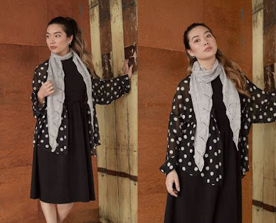
Nomad Jacket. This isn't bad from what I can see -- and it's undeniably a graphically striking piece -- but I do wish I could see the front in order to be able to assess it properly.
Bamboo Bars. This has a rough and ready look and the colourway is something of an eyesore.
Bonfire. Lovely stitchwork and a really eye-catching gradient colour scheme.
Autumn Sunset. The shape has an unfortunate boxiness, and I'm not sure that yarn works on a garment-sized scale.
Outlines. A boxy sweater that looks like the love child of a Muppet and a bathmat.
Saffron & Steel. This one is both graceful and distinctive.
Fault Lines. This is so 1986 in its oversized shape and graphic motif that I'm pretty sure I saw it on the cover of some Sweet Dreams romance novel, done in pastels and neon.
Soda & Ash. I do like the stripes, but while the descriptor for this piece claims that the "silhouette is generous, versatile, and perfect for chasing the chill", to me it looks perfect for horseback riding, because it would cover both the rider and a good part of the horse.
Magical Notes. I like this one. The lacework and the shaping are good, and the muted seashell colours are pretty.
Black Hills. This one has that "made of afghan" look.
Sand Mesa. This one has that "made of afghan" look and that "makes me feel like a couch" look. Such unflattering lines.
Tailored Tiles. Some nice mosaic work and the shaping is good, though as will be made clear by the next photo, the styling here does this piece no favours.
City Skirt. Here we have the matching skirt to the previous cardigan, which looks much better over short-sleeved and low-necked top. The lines of the skirt look good, and this really is a rather sharp-looking knit suit.
Alpha/Beta. I get where the designer was going with this, and it does have some nice features, such as the shaping through the body and the stitchwork, but that waistband makes the design looked tacked together and the slit sleeve looks terrible when the model raises her arm.
Alpha/Beta. This is the same design as the one above, done in a different yarn. It's a slight improvement, but the waistband still looks wrong and the sleeves still don't sit right.
Turquoise Trails. I'm really liking the bands of mosaic, which gives this piece quite an original look. I would raise the dropped shoulders and neaten up the fit a little, and I'd love to see this in some other colourways -- which is not to say this one doesn't work.
Southwest Duo. The skirt is well-shaped and a lot of fun, but that vest hangs like it's not even clothing.
Brushstrokes. That curved hem is different and beautifully done, and I like the shaping on the whole, but I think I might go with a cowl neck on this sweater as it'll echo the shape of the hem and the collar in the existing design is not going to cooperate by remaining in standing position as it must if it's to maintain the lines it ought to have. Also, that is one gorgeous yarn -- it's like a wearable Monet painting.
Wednesday, 12 October 2016
Knitscene Winter 2016: A Review
Knitscene has released its Winter 2016 issue. Let's have a look at it, shall we?
Snowflake Cowl. Nice piece, and a lovely rendering of the classic snowflake pattern.
Snowball Cap. Cute hat with some fun contemporary chartwork.
Ski Lodge Cardigan. A well-shaped and fresh take on the classic ski jacket.
Slopes Pullover. This works. I like that the eyelet work around the yoke is not too lacy, and the contrast bands at the neck, cuffs, and hem are smart.
Banquet Sweater. A pretty ballet-necked sweater.
Revelry Sweater. This is a nice design as is, but I think I might have taken this design concept steps further and added lace trim to the cuffs as well as the hem, and perhaps also more edging or even a collar to the neckline.
Soirée Cowl. Some lovely stitchwork in this cowl, though I wouldn't consider it quite polished enough to go with a bronze lamé dress, or to be worn to a soirée.
Fête Cardigan. A beautiful classic cable sweater.
Mirth Tunic. Very nice piece with some good shaping and eyelet work and an artfully rumpled cowl neck. Though I don't understand why the model otherwise appears to be attending a particularly vulgar party at the Trump Tower.
Blowout Cardigan. I like this sweater, but I am beginning to wonder if this photoset, which combines sensible, wearable, well-designed knitwear with ersatz glamour party trappings, is some sort of meta commentary on the mind-bending divide between the U.S.A.'s current two leading presidential candidates.
Spree Cowl. An attractive cowl.
Celebration Shawl. This is a nice piece on the whole, but I'd add some sort of edging to it, as it looks unfinished as is.
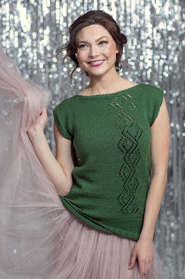
Gala Tunic. Nice top. Both the shaping and the diamond detailing work well.
Vanilla Jacket. I often comment that a design "didn't quite get where it was going", by which I mean that the concept had promise but didn't get the execution it deserved. The design concept for this item never seemed to have any desire to get anywhere in the first place, but rather dropped out of high school, then spent the next several years smoking pot and playing video games in the basement until its parents got fed up and kicked it out.
Hot Cocoa Sweater. A lovely use of a gradient colour palette combined with mohair silk yarn. This sweater has dropped shoulders, which ordinarily I'd fix, but I think in this particular sweater they might work as is.
Biscotti Sweater. Not a bad piece. I think I'd go with a more interesting colourway.
Macaroon Hat. Cute hat, though I question how well it will stay on without a stretchy band at its edge.
Latte Pullover. Nice piece for those especially cold winter days.
Frosting Pullover. This piece has some nice texture and appealing softness, but it's too sloppy in its shape to be attractive. It looks as though it took its name from the idea that it's the kind of sweater one wears when curled in a fetal position on the couch, eating frosting straight from the can.
Chocolate Chip Cowl. What a fun and inventive piece. I love the combination of the furry yarn and the houndstooth pattern, and this cowl also looks like it'd be a real comfort on a very cold day, much like a chocolate chip or three.
Subscribe to:
Comments (Atom)


