Friday, 20 June 2014

Creative Knitting Autumn 2014: A Review


Creative Knitting is celebrating its tenth anniversary with the release of their Autumn 2014 issue. Congratulations to CK, and let's have a look at the patterns in this issue.


The Alabaster Cardigan. Quite like this one, but then I have a weakness for this sort of warm, comfortable, textured cardigan. There's a certain casual elegance to them.


The Argentine Cowled Tee. I'd like this one if it weren't for that drapery hanging randomly off the front. It looks like some sort of dressing room mishap.


The Hinterland pullover. I don't usually care for the mullet hem, but I actually kind of like this one. Because it and the black panels are the only distinctive touches on this otherwise basic sweater and they work together, it has a certain smartness.


The Ocher Shell. I do like this one, which has both a good shape and eye-catching stitchwork, though the colourway isn't appealing. An attractive solid tone yarn would be a better choice here, because the design is so interesting on its own.


Simply Cozy Sweater. This is dead simple, but the woman who owns this sweater will probably get more use out of it than she would out of three or four fashion editorial-type designs combined. For very basic designs like this, go with a really beautiful yarn in a luscious colour. It'll elevate the resulting sweater into something special.


Trio of Cables pullover. I like this one on the whole, but my one quibble is that the edgings used here at neck, hem and sleeve aren't quite working. They make the sweater look unfinished. I'd maybe work up some sort of lace pattern similar to that used within the cable motifs to use instead.


The Uncommon Cabled Cardigan. I'm wishing we had a full frontal view of this cardigan, because I don't feel I can really be sure it looks good until I've seen one. It might look gracefully draped, or it might look sad and bedraggled. The yarn used here is a lovely colour and looks soft and delightful.


The Balla Vest. Not liking this much. It's square and bulky in a way that is going to do most women no favours.


The Bobble Fun Scarf. Good texture in this piece.


Double Triple Cowl. This one's fine when worn doubled around the neck instead of worn single as it is here, where it looks like a sad flat tire.


Levin Cowl. This also looks nice when worn doubled around the neck.


The Serendipitous Stripes pullover is the cover design from the very first issue of Creative Knitting. It is an appealing piece and an easy, flattering way to wear horizontal stripes.


The Sestina Tunic. This design looks less than half-baked and that dreary yarn choice is not helping. This would not be flattering on most women.


The Sugar Maple Hat is quite cute.


The Vortex Necklace. Not too impressed with this one. The shape is good but rendering it in yarn makes it look too clunky and more like a bit of sweater appliqué on the run than a piece of jewelry.


The Fabiola Cowl. I very much like this cowl, which is pretty and simple and wearable. I wouldn't make it in green or red, though, as that might occasion some Christmas tree skirt jokes.


The Loughmore Cardigan. This one's lovely. The shape is good, the collar sits well, and I like the use of the graphic style cables instead of a more traditional curved cable design, which gives it a welcome modern twist.


The Lyrical Lace cardigan. Quite like this one too. That lace block pattern is actually something quite fresh. I don't recall ever seeing anything just like it.


The Windsor Cardigan is the cover look from this issue, and I think deservedly so. It's very pretty and graceful and yet so wearable.


The Outland Throw. I don't care for this one. I can't see a coherent design in this picture of it, and I don't like the colours.


Wheatland Basket. Cute baskets.


Wyoming Set. These are a little too 4-H beginner knitting project for me.


The Arvada Cardigan. This is very pretty. I love the colours and the shape is rather stylish.


Eme's Dress. This screams "I just wanted to use up some scrap yarn any old how". Scrap yarn projects are not supposed to look like scrap yarn projects. This would be cute in a more unified colour scheme.


Irresistably Darling Cardigan. This is VERY cute, fresh, bright, and pretty. This designer knows how to work with colour, because all those different colours work together so well and the design is so integrated.


A collection of five baby hats. I don't like the purple ruffled one at top right, because the ruffle is just too exaggerated and overscale, but the rest are cute. These are projects you can use some scrap yarn for.

Wednesday, 18 June 2014

Ta Douleur et Ton Tricoter


In this 2005 video for French singer Camille's song "Ta Douleur" ("Your Pain"), Camille is provided with her onscreen wardrobe by some helpful animated knitting. If you don't speak French, you can find an English translation of the lyrics for "Ta Douleur" here.

Please be warned that this video is possibly not safe for at work viewing.

Monday, 16 June 2014

Vogue Knitting Early Fall 2014: A Review


Vogue Knitting has released its Early Fall 2014 issue. Let's have a look at it, shall we?


Pattern #1 Cropped Cardigan. This is very pretty and has some interesting detailing. The cropped length won't be for everyone, but it can be lengthened.


Pattern #2, Open Front Cardigan. Another very pretty cardigan with beautiful lacework and careful finishing. I'm not crazy about the way the front edges look so tacked together at the top. I'd be tempted to add three buttons, or button it all the way down.


Pattern #3, Cropped Cardigan. Not too taken with this one. The tri-colour combination (which doesn't work all that well together) and those randomly tacked-on leaves present as gimmicky rather than as integrated design components.


Pattern #4, Herringbone Cardigan. Oooh, love this one, which is elegant and classic. Though I'd ditch the varied length and split hems at the side.


Pattern #5, Waterfall Cardigan. This design looks okay worn fastened shut with a shawl pin in the VK360° video, but as you can see from the photo above, leaving it open is not going to do any woman any favours. Sweaters simply aren't meant to billow around one. I'd pass on this one, because having to wear it pinned shut at all times is too limiting and that back seam does look rather rough.


Pattern #6, Hip-Length Cardigan. Another lovely, classic piece.


Pattern #7, Scoop-Neck Pullover. I like this sweater except for those tacked-on crochet chains. They look too, well, tacked on. I'd knit vertical intarsia chains into this sweater instead.


Pattern #8, Fitted Waistcoat. This item is a beautiful piece of work... but I am having a difficult time imagining too many of the men of my acquaintance wearing it.


Pattern #9 is a tartan bow tie. It's well-designed, but again, not a piece that will appeal to a broad cross-section of men. I'm thinking the hipster or flamboyant types will go for it and carry it off well.


Pattern #10 is another bow tie. I don't like this one as well as the tartan tie — the shape isn't as good.


Pattern #11 is a straight tie. I quite like this item and think many of the men I know would willingly wear it.


Patterns #12-16 are represented in this collection of men's socks. I do like these socks... but for me. I'm not too sure most men would voluntarily wear any of these other than the charcoal and red hound's tooth pair.


Pattern #17, Long-Sleeved Pullover. I was all set to give this one a negative review until I saw the VK360° video, and saw that this sweater hangs very well when it's not being pulled about by its wearer. It must be worn over something else, of course, but this is an effective way to show an underlying pop of colour.


Pattern #18 is a lace vest. It's a solid piece of design with good shaping and an attractive texture.


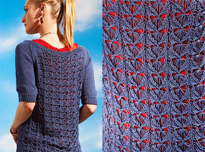
Pattern #19, Butterfly Lace. This is a good piece too. The lace pattern is something different and the shaping is good. I like that the designer went for a solid sleeve and shoulder. I've yet to see the pair of armpits that cried out for showcasing.


Pattern #20, Graphic Top. Not too taken with this one. It does have a certain appealing sportiness, but it also looks a little shapeless and lumpy.


Pattern #21, Cap Sleeve Top. Oooh, I really like this one, with its clever, fresh use of colour and stripes. It looks like it got where the previous design was trying to go because it has the same sporty appeal as well as some added sophistication and polish.


Pattern #22, Striped Pullover. This is a pretty basic and traditional striped sweater. It's fine, but I would maybe go with a less standard colourway than red, white, and blue to give it a little more interest. And this is quite a beach-y collection of sweaters for an early fall issue.


Pattern #23, Button-Back Sweater. This one is a little different, but in a way that works. Texture and shape are good and the curved pockets and back buttons are an interesting detail. This sweater is comfortable enough to be worn around home and stylish enough to be worn outside the home.


Pattern #24, Dolman Top. This looks... very eighties, both in terms of its mesh and shape. But it's not a bad piece and as long as you don't knit it in some Day-Glo colour, you won't have people asking where you parked your DeLorean.


Pattern #25, Reversible Wrap. Here we have the cover look. I'm not that impressed with it. It looks like it belongs on a couch.


Pattern #26, Cabled V-Neck Pullover. This is a classic piece. The designer has gone a little bolder with the cables than is usual, which was a good call as it gives it a more modern feel.


Pattern #27, Cabled Long Sleeve Turtleneck. Here's the long-sleeved, turtlenecked version of the sweater just above. The designer has added a turtleneck and sleeve cabling that work well with the proportions of the design.


Pattern #28, Garter Stitch Tank. Not liking this one. It has a crude and unfinished look to it.


Pattern #29, Drop Shoulder Pullover. This pullover version of the tank above is a slight improvement. The sleeves seem to balance it out a little and the yarn choice adds a little interest.


Pattern #30, Crew-Neck Pullover. Very much like this one. That centre panel is distinctive and carrying out the panel theme on the sleeves was a sound idea. For a solid tone pullover that can be worn anywhere, this piece has a lot of subtle visual interest.


Pattern #31, Sleeveless Shell. Not as pleased with this one, but I think it's the yarn choice. The stitchwork is getting lost in that slubbed texture yarn. A smooth yarn would have been a better choice.