Friday, 19 September 2014

Knitscene Winter 2014: A Review


Knitscene has released its Winter 2014 issue. Let's have a look at it.


The Haubergeon Sweater. Hmm. This isn't bad. It has shaping and some interesting detail and it's carefully finished. That sleeve length isn't going to be flattering on a lot of woman, but it's easily raised or lengthened.


The Cuirassier's Cardigan. Nice simple cardigan over all, but the way the front edges of this piece ride up makes it look like it shrank badly in the wash.


The Ornate Greaves legwarmers. These are nicely detailed legwarmers, but my guess is no woman who isn't either a dancer and/or under 20 would be willing to wear legwarmers out in public, and that even then she won't want to wear them styled like this. Sandals with legwarmers... really?


The Gothic Gloves. I rather like these. They're fun. But I would knit them in another colourway that does not include this dirty-looking yellow, and I'm not quite seeing how this design is at all gothic.


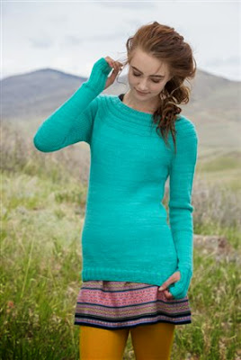
The Purbeck Pullover. This is a nice piece. The shape is good and the yarn choice works really well. I'm a little concerned about the way the hemline seems to curve up in front and longer in the back, but I'm hoping that's just the way the sweater happens to sit in the photos.


The Tongshan Sweater. The shaping is good, and the colour blocking at the shoulders and wrists isn't a bad idea, but I think there are much more attractive and interesting colour combinations for this sweater.


The Carrara Shawl. This is one outstanding piece of design. It's rare for stripes to look this polished and elegant.


The Siena Mittens. There are better colour schemes for these mittens, and certainly it's possible to better coordinate them with one's outfit than has been done here, but they're not bad.


The Paros Hat. Cute little hat, though again... you probably have yarn sitting in your stash that would look much more attractive than what's been used to make this sample.


The Kolmården Jacket. Very much like this piece. It has a polished look and smart lines and it would be a very useful item, looking equally right with jeans and a t-shirt or over a dress at the office.


The Malaga Pullover. Hoo boy. This sweater looks very much tacked together and homemade, as though it were made by this model's addled mother, who has never stopped treating him as though he were five and insisted that this sweater would be perfect for him to play cowboy in (he can pin his badge on the pocket!), then forced him to don not only the sweater but his old cowboy hat so she could take his picture and coo about how cute he looked.


The Ravenna Cowl. Nice piece, with nice textures in nice colours, styled nicely.


The Neon Mosaic Scarf. I like this one, though there is a right and a wrong side to this pattern and it might take some doing to keep the right side foremost.


The Otranto Cowl. Not sure about this one. The mosaic-style pattern is attractive enough, but it doesn't sit well in any of the five sample photos provided at the link. I'd be inclined to knit this one as a scarf.


The Tessellating Leaves Scarf. This is a really beautiful, striking piece.


The Thyri Pullover. This isn't a bad design on the whole, though there are more polished and pleasing versions of the circular yoke pullover, but this design marks the point where I decided I just can't even with the whole "half glove cuff" trend, open minded as I have tried to be about the concept. It makes the wearers look like they stuck their thumbs through the stretched out sleeves of some thrift shop sweater.


The Kelda Socks. Love these. I'm pretty sure that if I had a pair I would barely be able to stand putting shoes on over them.


The Hanne Sweater. Nice little piece with some interesting garter stitch detailing. It's on the simple and plain side, so this is one of those sweaters that call for an extra special yarn to elevate it a little.


The Ilsa Cardigan. I don't know about this one. Those circle and bracket motifs on the front just aren't that pleasing. It doesn't help that they look for all the world like eyeballs. Maybe it would work better in a more subtle, sophisticated colourway.


The Sanna Shawl. This is a very clever design that can look very different depending on how it's styled. It's quite modern and chic.


The Lene Vest. This is... not good. This poor model looks like she's been buttoned into something belonging to a child, perhaps by the same unhinged mom who is still forcing her grown son to play cowboy. This design looks pretty good from the back, but the way it hangs open in the front makes it look unflattering and too small.


The Rebecca Sweater. This looks like a 1980s design, and worse, like a 1980s design that should have remained in its own decade. The collar is ill-proportioned and the stripe and dot pattern looks cheesy.


The Lise Hat and Armwarmers. Cute, fun set.


The Meko Pullover. And we end well with a simple but striking classic piece with clean lines.

Wednesday, 17 September 2014

A Triumph of Combined Operations


This British Pathé video from 1954 gives us fascinating glimpses of the process of producing tailored handknit garments for high-end shops in London, England.

Monday, 15 September 2014

Knit.Purl Fall/Winter 2014: A Review


Interweave has just brought out a new magazine, or rather an old magazine in a new guise. The former knit.wear has been rebranded as Knit.Purl, and Fall/Winter 2014 is its first issue. Interweave has made another change in that they are now forcing their website visitors to become Knitting Daily members and login in order to view their magazine previews, so you'll have to create a (free) account with them and/or login to view the links I've provided for each design.


The Spiral Pullover. Hmm, kind of like this one, which has a unique and interesting texture. The cropped sleeve length doesn't quite make sense on a super bulky weight sweater, though.


The Equation Cowl. Rather like this one, which sits well and has good texture.


The Cobblestone Coat. I would like to like this one, which has some pleasing elements, but I can't because it is so unflattering someone ought to take it out back and shoot it to put it out of its wearer's misery. As you can see, it's doing this very slim, tall model no favours. This jacket would need to be totally reshaped to make it attractive.


The Woven Cardigan. Maybe I was too quick to suggest pulling the trigger on the Cobblestone Coat, because the Woven Cardigan is probably the design that most deserves to be led around back. Good grief, what woman wants all that bulk around her waist? And then to add a rope tie to it as if to underline the bulk? Moreover, when I'm not looking too closely at the picture, it looks like the sweater has tissues stuck into the holes in it. Kind of like how your mother used to wear tissues tucked up her sleeve, only more accessible and visible so the wearer doesn't forget they're there or run out of tissues or something.


The Cocoon Shrug. Hmm, I kind of like this one, which for all intents and purposes is like a shawl that will stay in place. It's the kind of thing you could keep at the office to wear whenever you get chilly.


The Fisherman Redux sweater. Hmm. I like this one overall as it has some great detail and shaping. I'm not quite sure about that hem, but it's interesting and not unflattering, so I think it works.


The Chevron Cardigan. This one's fairly traditional and classic and therefore fine. I would raise the slightly dropped shoulders and put in waist shaping, and I don't think those buttons are doing anything for this design.


The Oversized Crescent Shawl. I wasn't too impressed with this design until I saw this particular shot of it. Arranging it this way gives it some style and plays up the texture. I do love a nice shawl collar. I wonder if the shawl could be trusted to sit that way for any length of time though.


The Tuxedo Trapp. This one just looks kind of sad, limp, and bedraggled.


The Bio Palm. Oh dear. The Fug Girls of Go Fug Yourself coined the term "scroll down fug" to describe an outfit that looks fine above the waist and disastrous below it, but I think we need another term to describe a look that's okay in front but horrifying when seen from the back. Perhaps the "360 fug" or the "rotational fug"? Whatever term we go with, it applies here. Those sleeves look rucked up, the area around them puckers unattractively, and that seam over the butt looks exactly like a wedgie. I'd rejig this pattern in order finish off the sleeve in some other way, and ditch the tails entirely.


The Ply List Sweater. The yarn combination and the texture of this sweater are quite attractive, but the shape of the sweater leaves something to be desired.


The Curved Hems Vest. I'm not normally a fan of the spencer cut (in no small part due to personal bias, as I can't carry the style off myself), but I very much like this smart little number. It has lovely lines in both front and back.


The Golden Gate Skirt. Another very pleasing piece with flattering lines. This is a skirt a woman can get a lot of wear out of.


The Plumage Pullover. This is a beautiful design (love the perfectly executed "feather" motif and the ballet neckline), but I would want to lengthen it a little more and wear it as a dress as I don't think it's quite working styled as a tunic. The leggings this model are wearing are really showing through the sweater. Shortening this design to hip length could be another option.


The Lupinus Cardigan. Very pretty little cardigan.


The Pintucked Cardigan. This one is good except for the way it sits in the front, and that is a big minus as frontal appeal is one of the most important qualities in a sweater. In every front view photo of this design, the model's holding on to it to keep it in place, and even so it just looks shrunken and/or poorly made.


The Asymmetric Hem Pullover. I'm not normally a fan of asymmetry, but I think the asymmetrical hem gives this otherwise very basic sweater a stylish edge. The construction is clever too.


The Shifted Eyelet Yoke Sweater. Quite like this one. It's simple yet has interesting detail, will suit any figure, and is totally wearable.


The Minaret Mittens. These are cute. Mittens are a fun place to put intricate patterns like this because they look good in small doses. Can I just say, though, that I don't get the pointy-topped mitten thing? It's a common design element in mittens (I was looking for a basic child's mitten pattern on Ravelry recently and so many of the mitten patterns were pointy), but it looks as silly to me as pointy socks would, and one doesn't normally see those.


The Diamond Motif Scarf. I like this, which has a very Art Deco-like thirties vibe, but I do think the colour scheme could be greatly improved upon.


The Tilting Fair Isle Mitts and Hat. This is a cute set, and it'll be a great way to use up all those small amounts of sock yarn you've got lying about.


The Banded Sweater. Hmm. Not sure about this one. It is not likely to flatter a lot of women, and the colourway is doing the design no favours. I suppose it could work if done in some better colours and on a wearer who doesn't mind emphasizing her hips.