Monday 18 January 2016

Bergère de France Magazine 181: A Review, Part 1


Bergère de France has released its Magazine 181. Actually, they've released Magazine 182 and Magazine 183 as well. Malheureusement, I've let myself get behind on Bergère de France reviews, but I will be catching up in the next few weeks. Since there are 46 patterns in this issue, this post constitutes the first half of the review of Magazine 181. Part two will be released on Wednesday.


Pattern #1, Round Neck Fair Isle Sweater. This is not a fair isle sweater. This is a bar code sweater. However, it's not an unattractive or an unappealing bar code sweater, provided that you don't mind grocery store cashiers absentmindedly scanning it when you're checking out your groceries.


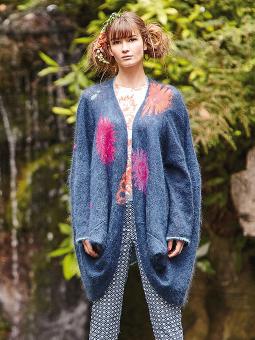
Pattern #2, Roll-Neck Sweater. This is simple but smart and attractive enough.


Pattern #3, Sweater with an Embroidered Collar. Oh, Bergère de France, sometimes you just don't even try, do you? When I saw this sweater in thumbnail I thought I was going to like it, because I assumed the collar had an interesting embroidered design and that the ribbon detail on the back was intarsia. Then I clicked. Turns out that's an actual ribbon, and I don't know why anyone would embroider the name of her sweater's colour on her collar. Is the idea that we will sometimes forget the word "black" and consequently will need to be able to rush frantically to the nearest mirror to painstakingly read the reverse image of the letters? If I were to make anything like this sweater, I'd be making it according to my initial assumptions on its details.


Pattern #4, Roll-Neck Sweater. This is a perfectly nice basic sweater, but unless you're surrounded by very high maintenance colour blind people who demand that you keep them posted as to the colour of your clothing, I see no reason why you'd embroider the name of your sweater's colour on your sweater.


Pattern #5, Cardigan. Frumpy.


Pattern #6, Tasselled Cheich Scarf. I rather like this one, though I think there are much better colourways for it.


Pattern #7, Short Sleeve Sweater. I think the idea here is to distract people from asking how the wearer's new anti-depressant dosage is working out for her.


Pattern #8, Hooded Sweater. I feel like I'm watching this nice hoodie get assaulted, with the green patches representing duct tape and those letters reading as a partially smothered cry for help.


Pattern #9, Hooded Sweater. Adding weird embellishments to a basic item does not a interesting sweater design make.


Pattern #10, Striped Sweater. This looks like something made by a involuntarily committed psychiatric patient during her supervised crafting time. During her unsupervised crafting time, she is making a ladder out of bedsheets.


Pattern #11, Bobble Scarf. The bedsheet ladder took longer than expected, so our crafty psychiatric patient also made herself a scarf to go with her freedom sweater.


Pattern #12, Roll-Neck Striped Sweater. This is the sweater our young pyschiatric patient whipped up to convince the hospital staff that she should be allowed to take two craft therapy classes rather than one craft therapy class and one music therapy class. One of the nurses, who reads this blog, told her that it was rather a nice sweater but that she might consider nixing the music notes and continuing the navy stripes onto the contrast yoke.


Pattern #13, Hooded Sailor Sweater. Omit that tacky pocket and this is a decent piece.


Pattern #14, Hooded Jacket. Not a bad jacket, but the studded heart on the back is too twee.


Pattern #15, Short Sleeve Sweater. This time a designer tried to turn a poorly shaped sweater into a good design by tacking all sort of random crap all over it. And we're also back to the colour designation thing.


Pattern #16, Roll-Edge Heart Sweater. This description refers to French flag heart on this item as "fair isle". I think the writer for the Bergère de France has mistaken the term for "fair isle" for "intarsia". It's not a bad simple design, though I would go with a black or a pale blue or some other than colour than purple for the main colour.


Pattern #17, Roll-Neck Raglan Sweater. The concept of appliqued commercially made patches isn't a bad one at all and this looks rather sporty, though I still think this sweater could have done without the embroidered "REO" on the arm. ETA: I could also do without the embroidered "RED" on the arm. We're not a bunch of five-year-olds, Bergère de France. We know our colours.


Pattern #18, Round Neck Fair Isle Moon Sweater. This isn't bad, though I would neaten up the fit a bit, and be sure not to disgrace myself among other knitters by referring to the finished item as fair isle, regardless of how Bergère de France may have labelled it.


Pattern #19, Short Sleeve Sweater. Is the Bergère de France design team just getting drunk, putting glue on random notions and hurling them across their atelier at the garments they've produced to see wherever they'll stick? Because I can't think of any other reason to attach a non-functional zipper to a sweater in this fashion. The silver cabochons on the sweater at least make some sense and look reasonably attractive, and the knitted item itself is fine.


Pattern #20, Sleeveless Sweater. This is unflattering as is, but shortening the length and adding some waist shaping would turn it into a decent basic piece.


Pattern #21, Poncho. For those nippy days when you want a poncho that's large enough for both you and the horse you rode in on. I do quite like the stripes, and for a poncho, it isn't badly shaped, but good heavens is this piece huge.


Patterns #22, 23 & 24, Man's Zipped Balaclava. The description for this design claims that it is "perfect for beginners and anyone who loves beautiful materials" and that the "purely decorative fastening adds a little touch of extra chic". Oh, Bergère de France, now you're just fucking with us, aren't you? When this magazine issue was being put to bed, your design team toasted each other with champagne and cackled that it would be such fun to see how far the rest of the world trusted the French reputation for chicness and whether anyone actually made and wore this merde.

Friday 15 January 2016

Modern Lopi: A Book Review


Today's post is a review of Modern Lopi: New Approaches to an Icelandic Classic, written by Lars Rains and published by Cooperative Press. Let's get down to looking at the Icelandic-inspired goodness within, shall we?


Asymptote, Men's Version. Lovely. The yoke's pattern has such a wonderful rhythm to it, and those grayish greens work so beautifully with the gray main colour.


Asymptote, Women's version. The Her version is also lovely.


Clapping Music. Not a bad-looking hat. It can be worn inside out for a different look.


Gimli. I like this design overall, but don't know if I care for the unusually deep yoke, which has a foreshortening effect on the torso.


Hildur. Very much like this one with its Fair Isle style yoke pattern and wrist bands. The colourway is lovely. Rains is clearly a very talented colourist.


Rúntur. This sweater was named after Iceland's infamous bar crawl tradition, with the implication being that this sweater was knitted by a drunk person who got it partly inside out. The concept is witty, but the execution looks lumpy and, well, too much like it actually was knitted by a drunken person.


Katla. Classic Celtic cabled sweater, with the difference that it was knitted with Lopi. It is rather on the big and bulky side, but sometimes a woman just wants a sweater she can cuddle into.


Hornstrandir. The basketweave stitch and blues and grays of this scarf are meant to represent the choppy waves and rugged cliffs of Iceland's fjords. It's an artistic concept and piece and yet is still a scarf that most men would be willing to wear. Nice work.


Winter Blueberries. Warm and wearable and attractive, and it will give you a chance to take your nicest shawl pin out for an airing.


Westfjords. The variation of stripe widths gives this piece more interest than the average striped hat.


Monsina, women's and men's version. This is pretty, but it is really, really big. Don't be afraid to neaten up the fit of any of these sweaters if you wish, and to add waist shaping.

Wednesday 13 January 2016

Rowan Knitting & Crochet Magazine 59: A Review


Rowan has released Rowan Knitting & Crochet Magazine 59. Let's have a look, shall we?


Gifu. Well shaped and has a pretty lace pattern.


Hiyama. This one is crocheted. It's a rather graceful-looking piece that would dress up simple summer clothes.


Kushiro. While I like the lace stitch used in this piece, it has some truly unfortunate and weird proportions which even this model isn't able to carry off.


Miyagi. Good shaping and some truly impressive stitchwork.


Osaka. Lovely. I especially like the delicate colour palette used here.


Oshima. Rather a nice combination crochet and knitted piece. I'd shorten the knitted ribbing on the sleeves to just a few inches as those awkwardly long sleeves are visually dragging down the look.


Gunma. This one's more than a little too slanket-like for my liking.


Saitama. Lovely and polished little classic cardi.


Iburi. A very successful marriage of traditional lacework with modern shaping.


Mie. This one looks like it's straight out of Dorothy Zbornak's closet.


Tokachi. I like the design of this, though that colourway is not an especially happy choice.


Memuro. This one looks to be in a style vein that my sister always refers to as "old lady", and by that I don't even mean the Golden Girls style of dress. I mean this sweater belongs in the same category as girdles, black lace ups, and blue rinses.


Yamagata. Not bad. The colourway is very good, which is not surprising given that this is a Kaffe Fassett design.


Niigata. Fabulous piece. Check out that artistic pleated diamond stitchwork and beading!


Yamanashi. This looks quite a lot like the curtains that were in the mistress bedroom of my house when I bought it. And that I used as drop cloths for painting.


Tochigi. This isn't bad, but I'd fix the drop shoulders and add some waist shaping.


Nemuro. Simple yet polished kimono-style cardigan. I'm imagining it in some higher impact colourways. Not that this subtle one isn't attractive, but this a piece that would look very sharp in, say, black and ivory or some other high contrast pairing.


Ibaraki. A lovely combination of lace and silk/mohair yarn.


Corton. Not thrilled with this one. The concept of combining nautical stripes and cables in one sweater has potential, but it didn't get the execution it deserved and looks tacked together, like some sort of Frankensweater.


Briston. Attractive, wearable, useful piece for summer.


Burnham. This isn't a bad example of a spencer, and it isn't badly styled here. This is what, in reviewer terms, is known as "damning with faint praise". Spencers are hard to wear.


Watton. These two models, one garbed in a bulky-looking, oversized design, and one in a wee spencer, are clinging to one another while they gaze off into a middle distance future in which they shall wear garments proportioned to best suit their figures.


Cottishall. Classic textured cardigan. I do love outfits composed of denim and chambray blues for summer.


Ludham. It never fails to amaze me that regardless of how many thousands of classic cabled sweaters there are out there, designers are still able to come up with little twists on the design. This one has a diamond motif, and it's a good look.


Darsham. The stitchwork in this pullover creates some very flattering visual lines. Excellent work.


Glaven. Bulky and oversized. It would look better if the fit were neatened up a bit.


Felbrigg. This one's so nice it almost makes me feel like going out somewhere to get myself a man for whom I could knit it. Almost.


Leiston. Call me hidebound, but my rule is never to make any knitted garment that sleeps more than two.


Kelsale. An excellent take on the classic gansey style.


Thursford. I wish I could see this one better. From what I can see, it looks like a decent piece.


Bodham. Solid classic cardigan.


Binham. Not too taken with this. The "sweatshirt detail" at the neck has a rather crude look to it.


Egmere. Some striking texture on this one.


Morston. So heavy and oversized looking.


Reydon. The large scale diamonds on the front of this classic sweater give it an updated look.


Heacham. This open shouldered top wouldn't ordinarily be my type of thing, but I think it works. It sits well and has a certain breezy, "sexy without trying too hard", style to it.