Showing posts with label Knitter's Magazine. Show all posts

Friday 29 August 2014

Knitter's Magazine 116: A Review


Knitter's Magazine has released Issue 116. Let's have a look at it, shall we?


The Morphing Cables vest. This is a nice piece overall (it's hard to go wrong with classic cables), but I do have reservations about those open lower front edges. That fashion of not only leaving them open but having them sheer away from each other is never very flattering and tends to make a garment look like it's too small.


The Gutsy Grape jacket. This is not a bad piece. It is a bit bulky but the overall lines are good. I'd run the buttons all the way to the bottom for the reasons mentioned in my review of the piece just above this one.


The Alita Dress and Bolero. Oooh, love this set. The lines are good, the stitchwork is good, and the idea of making a coordinated dress and bolero set like this is an inspired one, as boleros work best over a dress. I'm gnashing my teeth that I don't have the right figure for these two pieces.


The Chocolate Ribbons hat, cowl and fingerless glove set. The cowl and the gloves are pretty good, but the hat has a rather odd shape to it.


The Hey Sport cardigan. Nice classic, wearable piece with good lines.


The Well-Grounded cowl and mitts set. I'm going to give a qualified approval of this set — qualified because I'd like to see how that cowl looks when worn as a cowl usually is, i.e., hanging down in front rather than being used by the wearer to play peek-a-boo. I do like the stranded colourwork effect.


The Power of 2 cardigan. This is quite a smart, eye-catching piece. The horizontal stripes around the waist isn't all that flattering, so this may not be the right piece for a wearer who doesn't care to emphasize her waist/hip area.


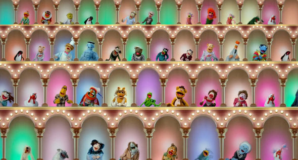
Three-to-One Windows hat and mittens set. I do have reservations about the deep brim on the cap, but that's easily changed and this is undeniably a really pretty set. The pattern and the colours used here work beautifully together. It does remind me a little of that open arches set piece from the opening sequence of The Muppet Show, but then that's a good thing.


The Layer Me Jacket. I'm not all that taken with the stitchwork and colourwork used on the body of this jacket, but the overall shape and particularly of that notched collar is excellent. I'd be inclined to knit this jacket up using the shaping from this pattern and using a colour chart from any other pattern that especially pleased me.


The Tempting Twists Coat. Lovely, classic piece overall, though I must admit that slightly asymmetrical collar bugs me a little. It looks like a mistake.


The Strategic Strands pullover. Not too impressed with this one. The front placket and the collar sit so poorly that the design looks rough and amateurish.


The Empire Shawl. Very pretty piece. The yarn used here is lovely.


The Rasta Braids top. This is quite a cute little piece. I'd be inclined to ditch the stripes and go with a beautiful solid or subtly flecked colour. This little cardi has plenty of visual interest in its lines and stitchwork and the stripes feel like overkill.


The Jazzed cardigan. I very much like this design overall, but I would totally knit this in another colourway. That candy floss pink and blue combo would be pretty difficult for an adult to carry off.


The Artist Smock. This one is too busy and boho for my tastes. It's not going to be all that flattering either. It might work on a artsy type, but I think even then I'd say that there are better uses for the lovely silk yarn used to make this item.


The Enchanted Cables cardigan is a beautifully detailed piece.


The Oh! Jackie suit. This hasn't been at all a bad issue, but it does not end well. From the unflattering lines to the mottled-looking yarn to the tacky and tattered-looking edging, this pattern is uniformly bad. The pattern description says, "The clever loop stitch at the borders adds a designer touch much like what Coco would have used", but I think Coco wouldn't have used this border and would have fired anyone else who did. All I can say is that at least this is an aptly named design. If your friend Jackie came toward you wearing this, you would almost certainly say, "Oh! Jackie."

Wednesday 28 May 2014

Knitter's Magazine 115: A Review


Knitter's Magazine has released issue K115. Let's have a look at it.


This is the Sand Dollar Shift. It's not bad. The asymmetrical tunic length isn't going to be for every woman and will probably look best on tall women, but it would be easy to make this either shorter or longer so it can be worn as a dress. This piece would make a good beach cover-up.


The City Girl design. This is... okay. It is eye-catching, and the use of appliquéd elastic braid is an original touch. I think there could be more interesting colourways for it.


The Dangerous Curves design. This looks like something some biker's overly attached girlfriend whipped up to match the paint job on his Harley, only to have her plan fall flat when he took one look at her, gulped, and roared off out of her life. It's the pastel yellow that's actually the problem here, I think. A bold design like this called for strong colours.


The Entrelac Blue jacket is a very cute little number. It has a good shape and nice detailing.


The Indigo Incline design is a decent piece of work. I think I would be more enthusiastic if it were the sort of thing I could wear myself. This is for the small-breasted woman, because that stockinette band slanting across the front needs to lie flat.


The Ridgeline Cowl. I like the rainbow brioche texture of this, but I wish it had gotten the design it deserved. These pieces look like swatches stitched hastily together.


The Shirttails design. Very pretty and quite wearable little camisole.


The Intentional Ikat shawl has a really exceptional gradient colour effect. It takes a very accomplished designer to make a garter stitch project look this sophisticated.


The Tranquil Tunic and Cowl is a nice set. The sweater looks very pretty on its own (love the lace stitch), and the cowl really looks quite convincingly like an attached cowl neckline.


The Sandy Circle capelet is quite an attractive and useful little piece.


The Trails and Tracks tunic is another one of those pieces that will look best on tall women, though it could also be worn as (or lengthened into) a dress for shorter women. And it's not bad, though I definitely would not use this yarn, which more than borders on "ugly afghan" territory.


The Network sweater is another take on the classic navy and white stripe sweater for summer. It's got a few interesting touches in its open texture and varying stripe widths. I'd raise the dropped shoulders though.


The Catalina Crew. Very pretty lacy summer top. The sleeve length is a difficult one to wear, but it's easily shortened or lengthened.


Upstairs and Down. Really not liking this scarf, which looks too heavy and unwieldy to be worn to advantage. What you're looking at here is a thwarted afghan.


The Lanes and Lines dress. I think this design would look better as a sweater. This isn't a bad graphic pattern, but it is one that is best in smaller doses.


The Mulberry Lanes sleeveless tunic. Those heavy horizontal lines around the hips and midsection are not going to be one bit flattering. As you can see, this piece doesn't seem to be working very well even on this professional model. She's got her arm barred across it, and it's been shot from a side angle. It's never a good shot when the model and photographer have to resort to such maneuvers to make a piece look good.

Friday 28 February 2014

Knitter's Magazine 114: A Review


Knitter's Magazine has released Issue 114. Let's have a look at it, shall we?


The Sand Pebbles vest. I rather like the texture of this, but it's definitely on the shapeless and bulky side. I wonder what it looks like buttoned up. Those hairs on the sweater aren't adding much to the effect, but who am I to judge? There are a number of cat hairs visible on my project pictures.


The Majestic Tank. The model is kind of working this, but it still looks like it shrunk in the wash, and for most women it's unwearable. Lengthened by about a foot, it could be a pretty sleeveless top. The yarn and lace employed here are rather attractive.


The Aria cardigan. I absolutely love the texture of this cardigan, but it is just so shapeless that it's not even doing anything for this model. I'd use that yarn and stitch on another cardigan pattern.


The Letter Perfect vest. I always do have a hard time reviewing open-front cardigans and vests. I can't get past the conviction that they're going to look shapeless and frumpy on most women. This looks good until we get down to chest level and then... I just want to make it more fitted and buttoned through the body. I do quite like this fresh, bright colourway.


The Streamlines shawl. Now here's something different from all those pretty but run-of-the-mill lace shawls. This is one very cool, modern shawl. I think it would be impossible not to notice this piece if I saw it on someone.


The Blurred Lines top. This isn't a badly designed piece at all (those stripes are quite interesting and creative), but the design does look undeservedly bland and frumpy in this sample knit. I'd shorten the sleeves a few inches and go with a sharper, more interesting colourway.


The Tulips Tunic. Sheer lace (and this lace pattern is lovely) does make a drapey style easier to wear. I don't care for the styling here though. I'd wear this over a simple fitted dress, as though it were an alternative to a lace shawl. And I would shorten the sleeves. That just above the elbow length is difficult to pull off.


Chevron Skirt. Oh honey, I know your grandma made this for you for Christmas out of one of her rec room afghans, and that you really love your grandma, but seriously, you don't need to actually wear it. If your grandma thinks this is attractive, she probably also thinks the Cold War is still on and you can tell her it came in handy as part of your bomb shelter wardrobe stockpile.


Daring Dashes top. Hmm. I'm not crazy about this, but I suppose it isn't terrible. I'm trying to figure out what the model has on underneath this top that would show black around the waist and near the shoulders but is looking like skin tone at the chest and midriff. A solid colour tank top would be the best under layer for this top, and I'd make sure that it was of a tone to work with whatever the knitter chose for the single-ply dashes. Black and dark purple really don't do anything for each other.


The Blue Helix sweater. Quite like this one. I do wish there were better or other views of it though. It's hard to get an idea of how something flatters or looks from just a side view.


The Mesa Tee. A nice-looking top with a definite southwestern vibe.


The Lolita sweater. I rather like this one. Not all women care to bare their midriffs of course, but the top has enough going on that it could be made with a straight, full-length hem in front rather than this curved and cropped one, and still be an interesting look. I like the idea of contrasting colours in the ribbing.


Ombre Fans afghan. Very pretty, and a great way to showcase a variegated or hand-dyed yarn.


Flashes and Dashes top. This is pretty, but it does fit like a Hefty bag. I'd make it standard fit.


The Flip Side pullover. This is an attractive and interestingly textured sweater.


The Lucerne vest. This is a polished, classic piece that will never go out of style.


The Slip Shape top. This is quite a smart graphic effect and has a good shape. I'm envisioning this top in a number of bright, pretty colourways. (Not that there's anything wrong with gray and white — I just can't wear it myself.)