Showing posts with label Rowan Knitting and Crochet Magazine. Show all posts

Friday 4 July 2014

Rowan Knitting & Crocheting Magazine 56, Part 2: A Review


Welcome to Part 2 of my review of Rowan Knitting & Crocheting Magazine's issue no. 56, Part 1 having been published two days ago.


The Martina design is a good piece of work. I do like to see a vertical stripe pattern now and then. Designers tend to go with the horizontal stripe so much more often, probably because it's easier to knit, but the fact is that vertical stripes are so much more flattering that they're worth the extra work.


The Gisela pullover. Very pretty. It has a certain vintage-like feel to it. Smart little short-sleeved knit tops were a wardrobe staple for women between the 1930s through the early 1960s.


The Anja design. This isn't bad. I wouldn't pair it with a flirty little skirt, though. It looks more to me like a very casual piece that belongs with jeans.


The Franziska pullover. I can't get behind (or more to the point, into) the very oversized sweater thing. They're unflattering for most women and they catch on things and generally look sloppy. The overall design of this is quite attractive, but if I were to make this I'd make it a standard fit and raise those dropped shoulders.


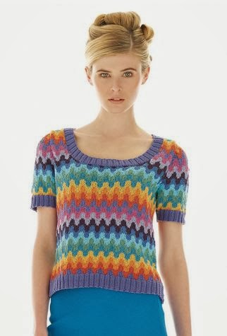
The Karolin sweater. This is attractively and interestingly patterned sweater, but I wouldn't wear it with that pink skirt. For that matter, I wouldn't wear that pink skirt with anything.


The Brigit sweater. This is totally cute. Love the polka dot and stripe combination, and the shape is excellent.


The Lea pullover. Another little top with vintage appeal. This is really adorable.


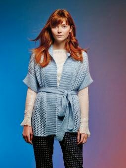
The Isolde Wrap has a southwestern U.S. style, an offbeat colourway, and a name from a German opera. There's nothing like a little eclecticism, I suppose, especially when a knitter can take or leave all three. I do like the wrap, though it would need to be styled a certain way to work.


The Ulrika cardigan. I would have called this one The Coat of Many Colours, but it doesn't seem like a design likely to arouse much jealousy in one's siblings. I think it falls down on the sleeves, which look too drab and disconnected from the rest of the sweater even though they do echo the brownish stripe used through the body, and in the shape, which is too much on the shapeless side.


The Symphony design. This lace tunic is pretty in its way, though I am trying to figure out how one would style it. One would need to wear basically a full outfit under it (unless one is, say, Rhianna), and that would take some thought, because layering another sweater under it would be too bulky and I don't think wearing trousers under it would look right. I don't think even this professionally styled outfit is quite working. I may seem to have gone off topic here, but figuring out how you'll wear an item should be part of your decision process when you decide whether and how to make it if you want to be able wear it once you're done. I have one sweater I have yet to wear even though I love it, because nothing I own looks quite right with it and I haven't gotten around to buying or making something specifically to go with it.


The Poetry sweater. This is pretty basic but it's a competent piece of design and could be a useful item for a woman to have if the tunic-length sweater is her style and works on her figure.


The Muse pattern. This is a very simple item, but it does have some texture and the shape is good. The thing to do with basic patterns like this is to make them in a beautiful yarn in a colour you love, because it'll wind up looking like a special piece as well as one that you can wear to death.


The Prose design looks like a costume straight off the set of Depressed Housewives. If you're going to knit this one, make sure it buttons through the hips, because "a few strained buttons done up in the middle" is not a flattering look. You can probably also find a more appealing colour than this drab oatmeal.


The Song tunic. This piece is filet crochet. I like it — the shape is good and the chevron pattern is a nice look.


The Melody sweater. Not a bad piece, though I think I'd go for a more sophisticated colour than a pastel.


The Lyric pattern. Not a bad little piece but it won't be the easiest sweater to wear. It would me look terribly dumpy. Shortening the cap sleeves by a few inches and lengthening the body/making the waistband shorter would make this an easier item to carry off.


The Ballard pullover. This is one of those designs even a model can't carry off.


The Drama pattern. I don't know why they named this pattern Drama because there is no drama in sight. The split hems are the only design feature here, and they aren't adding anything. I'd give this pattern a pass entirely, because it's nothing special in any way and there are so many wonderful patterns out there.


The Verse design. This isn't a bad basic sweater, but I'd neaten up the fit somewhat.


The Stanza sweater. I like this one. I think my favourite thing about it is the wide turtleneck, which is a good way for those of us who don't look good in turtlenecks to wear a turtleneck.


The Rhyme design. I like this one, but I would make those sleeves more fitted. Baggy sleeves never did a woman any favours.

Wednesday 2 July 2014

Rowan Knitting & Crocheting Magazine 56, Part 1: A Review


Rowan Knitting & Crocheting Magazine has released issue 56. It has 41 patterns in it, which is a bit much for one review, so as per usual for me when I write Rowan reviews, I'm going to review the first half of the patterns today and the remaining patterns on Friday. Let's look at the first 20 patterns, shall we?


We begin with the Ordie design. I like it, and I like the idea of incorporating stripes of colour, though I don't care for the colours used in this sample.


The Moraig design. Like this one too. It's classic, and yet that fair isle pattern is a little different from any I've ever seen before.


The Ness design. Love this one. The colourway is gorgeous and that's a really original rendering of a fair isle yoke. I'd be inclined to continue the pattern all the way down the sleeves and just work a cuff length in the main colour, though. This does have a slightly unfortunate dropped shoulder visual effect.


The Ashie pattern. Very much like this tartan and cable pattern, though the colourway doesn't appeal much.


The Carlochy design. Love the tartan design of this one, but have my concerns about the shaping. If those front edges don't meet in the front, I'd reshape them so that they do, because that is not a flattering style for most women.


The Heilen pattern. This is a decent design except for the sleeves, which manage to look both stretched out and shrunken. I'd make the patterned part of the sleeve no longer than cap-length and knit the rest of the sleeve in the blue.


The Scaven design. This is a nice piece, though that gradient yarn effect isn't quite working as it should — it looks a little muddled. It can be difficult to find yarns that are just the right shades for a project like this.


The Brack Cape has a good texture but I don't know if anyone will notice it because they'll be too preoccupied with wondering if the wearer's arms are deformed.


The Roan jacket. This is quite a gorgeous piece of design (love the stitchwork and the colourway), but I would raise those dropped shoulders.


The crosses used here make the Fergus design a new take on the classic cabled pullover for men, because they stand out so much. I'd say they work quite well.


The Laide pattern. Love this one. It's simple enough to go with a pattern as it does here, with this kilt, and yet interesting enough to be worn with a basic skirt or jeans.


The Brora sweater. Love this one too, with its classic cables and very well integrated leaf vine motif.


The Ailish turtleneck. This one is a very decent piece of work. I don't think I like the colour change in the cuffs — they look a little random. I'd do the cuffs, collar and hem in the same colour, whether that colour is the main colour or one of the colours from the tartan.


The Craggie turtleneck. This is a little unusual in terms of menswear, but I think it works. If you're knitting this for a man who isn't you, I'd run it by him first to make sure he will wear it.


Quite like the Fyn jacket.


The Katja sweater. I knew as soon as I saw the thumbnail for this design that this had to be a Kaffe Fassett design, and it is. I can't imagine I'll ever criticize a Fassett design for its colourwork, as he is a master of colour, but I will recommend raising the dropped shoulders and maybe neatening up the fit of this design a little.


The Tanja design is another Kaffe Fassett piece. It's an eye-catching piece and the shape is good.


The Elsa pattern. I like this one, but am I imagining things or do I see a subway stop in that pattern?


The Heike design. I like this one, though I am fighting the urge to make a bib joke.


The Angelika design. Another pretty one. It's perhaps a little boxy in shape, but that's not hard to fix.

Look for the second half of the Rowan Knitting & Crocheting Magazine issue 56 review this coming Friday!

Wednesday 22 January 2014

Rowan Knitting and Crochet Magazine Issue 55: A Review, Part 2

Let's look at the second half of the patterns from Rowan Knitting and Crochet Magazine's Issue 55, since we looked at the first half of its patterns on Monday.


The Wharf design. I rather like this smart, casual sweater. If you don't care to show any midriff or this is too fitted for you, it could be easily made a little longer and looser.


Not a fan of the Boardwalk design, which seems better suited to a little girl or a Muppet than a grown woman. Nothing against little girls or Muppets, you understand.


The Sailor design is another smart casual look. And it's well-styled here. A cute striped skirt like this one combined with this top will make the perfect easy, wearable summer outfit.


Very much like the Celeste design. The stripes are fresh and cute and fun in an adult fashion rather than in a Muppet-appropriate way. NOT MUPPET-IST.


The Buoy design. This is pretty run-of-the-mill design, adequate and wearable without being notable in any way.


Not crazy about the juxtaposition of the stripes and lace in the Port design — they're just not working together as they should. I'd make that waistband plain stockinette in the main colour.


The Surf design is another Muppet-suitable look. I'm being too hard on this one, probably, because maybe a lot of people would think it cute and fun, but those ripple patterns always look too afghan-like to me.


The Cove design. Hmm, a striped t-shirt with a peplum. I'm surprised to find myself typing that I actually kind of like this one. It is a very young woman's style, but I can see it looking cute on a teenager or early twentysomething.


The Sally design is another cute striped number that a grown up can wear. I wish designers would work with vertical stripes more often. They are just as sharp and so much more flattering than horizontal stripes.


The Driftwood pattern. Rowan has really gone to town on stripes in this issue. This one isn't bad, but I would fix the dropped shoulders, make it long enough to cover my stomach, and go with another colourway. This one looks just too Christmassy for a cotton sweater. Unless of course you live in Australia where it's warm at Christmas.


The Pier design. This is another cute little top. Again, if you wouldn't be comfortable in something this short and fitted, it can always be made longer and wider.


The Promenade design. SO MANY STRIPES. The stripes are done in an interesting way and the sweater is well-shaped, at least, so that the overall look is good.


The Gift design. This one isn't bad, though I think it does call out for some tweaking. I'd fix the dropped shoulder and put a bit of ribbing along the bottom of the body. The hem here doesn't look finished.


The Divinity design is a rather nice, simple little top.


The Sierra Wrap. Not a fan of this, which looks a little rough and ready and awkward in shape.


The Chiquitta design. This is afghan-like and very unflattering (admittedly, those two qualities do tend to go hand-in-glove in knitwear). It's never a good sign when the model is shown from a angle rather than full frontal.


The Shore pattern. Another very decent striped pullover.


The Azerbaijan design. I knew this was a Kaffe Fassett as soon as I looked at. As always Fassett's colourwork is distinctive and masterful, but his shaping can be difficult to carry off. If I were making this for an intended wearer who does not have a model-type figure, I'd reshape the item to be standard fit with a cap sleeve.


The Belarus design. The colourwork here is GORGEOUS, but I'd be doing some reshaping of the body of this cardigan, which looks too big and unstructured to flatter most wearers.


The Estonia design. Another Kaffe Fassett design. This one is actually quite well shaped, though you might wish to make it longer and looser than it appears here.


The Latvia design. The only change I'd make to this one would be to make it in some non-pastel colourway, but that's personal preference rather than because there's anything wrong with this palette.


The Lithuania design. This one's sharp and wearable. Though I would not put it with those pants.


The Slovenia design. Love this one as is, although it does appear to be a little long for this (probably tall) model. That's easily remedied, though.


The Moldova design. I see even Kaffe Fassett has climbed aboard the stripe train. Not bad, but I would neaten up the fit and shorten those sleeves a little. That just above the elbow length tends to look dowdy, particularly when it's loose fitting.


The Adella design looks like an afghan with sleeves. It's all bunchy in the back and none too flattering in the front. Afghans really only belong on couches.