Monday, 12 January 2015
Rowan Knitting & Crochet Magazine 57: A Review
Rowan has published issue 57 of the Rowan Knitting & Crochet Magazine. Let's have a look at it, shall we?
Simona. Lovely little shawl.
Zarah. The front of this top looks unobjectionable, but the pattern description mentions that it's "strappy" and has "ribbon across the back", so I would need to see a back view before I sign off on it.
Mariella. Nice little surplice top for summer.
Esta. Classic lace cardigan.
Alda. Not thrilled with this one. The empire line and the loose sleeves will make it unflattering on many women.
Eloisa. This woman fought the doily, and it was an inconclusive win.
Donnie. Cropped length items flatter very few women, and the body of this sweater looks absurdly shrunken when compared to the sleeves.
Violetta. Love the textured leaf stitch used here.
Fia. Very pretty, though again the pattern mentions that this design has a "lace back" which isn't shown here.
Nicci. Not too taken with this one. It does have a forties vibe to it, which I like, and it's well-shaped, but the waistband looks a little random. This top needs some finishing details in the waistband stitch, such as a collar or cuffs, to pull it together.
Elda. The black-on-white intarsia floral motif here is lovely, but I'm not caring much for the oversized tunic shaping, which tends to look rather frumpy on most women. I'd neaten up the shaping and make this in a relaxed fit tunic instead.
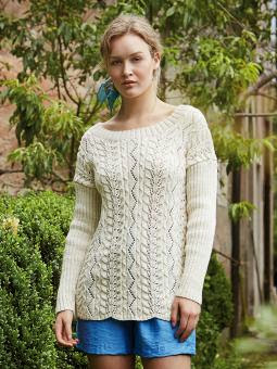
Catarina. Lovely textured pullover for summer, though I would fix those dropped shoulders.
Massa. This sweater looks like it was made out of a circus tent, and not successfully.
Poppi. This top isn't bad overall, but the colour combination is doing nothing for it and I suspect it could probably use some waist shaping.
Borro. This is... okay... at least compared to the circus tent number a few designs above. I think I'd want to go with a higher contrast colourway.
Prato. The shaping could be better (I'd suggest waist shaping and a slightly neater fit), and this colourway isn't working well.
Sorano. A dull colourway, dropped shoulders, and it's huge. Next!
Arezzo. Interesting pattern and the shaping is good overall, though I would correct the dropped shoulders.
Empoli. Quite like this one. The saddle shoulder construction works well with the stripe design.
Vicchio. The design of this one is good, though I'd go with another colourway. This one is a little too close to pastel.
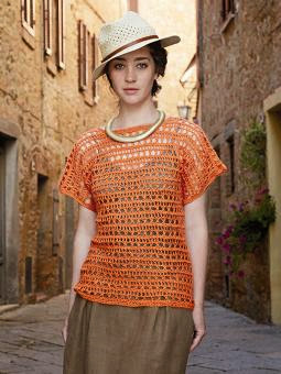
Sieci. Openwork crochet in a linen yarn. It looks like a shopping bag with sleeves and I'd expect it would feel chafey.
Cetona. I think I would like this crocheted top better in a solid colour. It has a decent shape and texture, and making it multi-tone is overegging the pudding.
Masotti. Quite like this one, with its open cable pattern. This stitch adds texture without adding bulk.
Olympia. Cute but needs shaping and a little more length. Cropped and boxy is a bad shape for most women.
Hestia. I like this one. The shaping of the neckline and the detail around it give an otherwise standard tunic all the interest and style it needs.
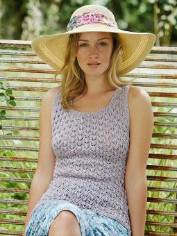
Aldephe. Nice little tank.
Delia. More than a little too shapeless.
Alexus. Not a bad little dress, though it does look like it could do with some waist shaping.
Philomena. Cute little top.
Ianthe. Simple, useful pullover.
Elektra. This piece was clearly meant to be a knitted take on the denim vest, and it's not bad. I think I might be inclined to make it in a yarn that isn't denim-like, though, like a fine wool or even a luxury mohair, as that would mean it could be worn with more items than just jeans.
Cybele. This cropped surplice sweater is unflattering even on the model.
Artemisia. The description for this item refers to it as an "open back cardigan". It's clearly not a cardigan, and my guess is it isn't open back either. It looks like a very basic pullover and seems unobjectionable.
Nemesis. Simple pullover, but what makes it special is that it's knitted in Rowan's Kidsilk Haze. Kidsilk Haze really is one luscious, beautiful yarn that elevates any project it's used for.
Arcadia. This has a couple of interesting textural details, but the oversized fit looks none too flattering even on the model.
Friday, 9 January 2015
Bergère de France Magazine 177: A Review
Bergère de France has released Magazine 177. Let's have a look at it, shall we?
Pattern #01, Cable Tank Top. Classic cabled vest.
Pattern #02, Jacquard Cable Sweater. I give Bergère de France points for trying to be original, especially in menswear, where original knitwear design usually means an arguably new arrangement of classic cables done in a daring shade of gray, but I don't think these asymmetrical sleeve designs are working. Love the sweater otherwise, but I'd pick one of the sleeve designs and use it on both sleeves.
Pattern #03, Shawl Neck Cable Cardi. Classic sweater. The minimal shawl collar does give a it a bit of an updated feel.
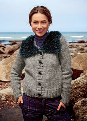
Pattern #04, Fur Collar Jacket. Can't say I care for this one. It isn't shaped with any style and has a dumpy look.
Pattern #05, Cable Jacket. Like this one on the whole, though I do have some reservations about the dropped shoulders and the horizontal cables on the arm, which aren't flattering. The leather fastenings are a nice touch. I think I might be tempted to go with another zippered jacket pattern and borrow the leather clasp idea for it.
Pattern #06, Double-breasted Jacket. Don't care for this one. The collar is poorly shaped and the design looks rough and amateurish on the whole.
Pattern #07, Long V-Neck. Very sister wife. (This is not a good thing.)
Pattern #08, Cable Tank Top. Solid classic piece.
Pattern #09, Button Neck Sweater. Classic henley that would look well on just about any man. As you can see, it isn't exactly detracting from this model's looks.
Pattern #10, Roll-Neck Sweater. Lovely classic turtleneck.
Pattern #11, Top Down Jacket. This isn't just sister wife, it's "depressed and alienated sister wife whom all the other sister wives pick on".
Pattern #12, Rolled Edge Beanie. Shapeless and too large hat.
Pattern #13, Hooded Cable Jacket. Very decent cabled jacket. Though I am getting the feeling this is this woman's very first day as a sister wife and she's anxious to make the best fried chicken dinner ever to make sure she gets off on the right foot.
Pattern #14, Hooded Sweater. Not bad. I like the concept of the side buttons echoing the buttons at the placket.
Pattern #15, Shawl Collar Cardi. Not liking the asymmetrical design here. I'd put that cable motif on both sides. And style it over things that actually go together.
Pattern #16, Short Cable Sweater. Not bad. It's not looking too flattering here, but I think that's the styling. I'd put a bulky item like this with a fitted bottom rather than a pleated skirt.
Pattern #17, Flared Tunic. I'd reshape the bottom of this. A sweater that flares unecessarily through the waist and hips will do no woman any favours.
Pattern #18, Jacquard and Cable Sweater. Not a bad incarnation of the circular yoke sweater.
Pattern #19, Asymmetric Zipped Sweater. I don't like "design on the one side" concept here either. If I were to make this one, I would knit both sides and the sleeves for the sweater in the cable pattern (which is quite nice), fix the dropped shoulders, and keep in mind that this item won't look good worn open.
Pattern #20, Tunic. This lovely yarn (created by knitting two different yarns together) deserved better than to be made up into a sloppy poncho.
Pattern #21, High Neck Cable Sweater. Nice piece. It looks like it has good shaping, which is crucial in a bulky knit like this.
Pattern #22, Jacquard-Look Sweater. The dropped shoulder is used here as a way to create visual interest, and it's not working any better than it does when it's simply part of the shaping.
Pattern #23, Large Snood. Dead simple yet wearable piece. I rather like the idea of making a cowl to match a sweater with a simple neckline. It gives one a way to freshen up the sweater and would be a good way to use up a leftover skein of yarn.
Pattern #24, Tunic Sweater. Quite like this one. The gradient effect was created by knitting two strands of different yarns together, which is a brilliant idea to keep in mind for some future project. It's a way to create colours that blend well if you're unable to buy them as is.
Pattern #25, Top Down Cardi. I would definitely neaten up the fit of this and run the buttons from the top of the neckline to the hem. It's not a bad design on the whole, but it looks unfinished and frumpy as is.
Pattern #26, Round Neck Cable Sweater. Nice classic piece. And that is some good styling, because it's made a standard piece look chic and eye-catching. The right accessories and colour scheme do make such a difference.
Pattern #27, Openwork Cable Sweater. Quite like this one. It's well-shaped and the texture is so good.
Pattern #28, Chunky V-Neck Cardi. Another sister wife fashion. And by the looks of it, this sister wife has been secretly growing some mary jane in the kitchen garden and smoking it out behind the bunkie with some of the oldest of her "nephews".
Pattern #29, Short-Sleeved Cable Sweater. Bergère de France has clearly tried to give the cable sweater a fresh look here, but using the kind of shaping that is consistently unflattering is not the way to do that.
Pattern #30, Cable Cardi. And we end with another solid classic piece.
Subscribe to:
Comments (Atom)


