Thursday 24 January 2013

When Two Become One


I suppose this laptop-viewing sweater is one way to make sure that pesky real life events (i.e., your kids are playing with the electrical outlet, or your spouse announcing a decision to divorce you), doesn't distract you from your oh-so-important video game or internet chat or porn. But upon reflection you might prefer to knit your laptop its own little Irish cabled sweater so as to be able to store your laptop snugly away and do a little more living in the real world.

Wednesday 23 January 2013

Moby Ripped


In 2007 Greenpeace Poland aired this anti-whaling commercial. It uses knitting to convey their point, and the imagery was so striking that it made me do a little Googling to find out whether I agreed with Greenpeace's stance that commercial whaling needs to be banned worldwide, so I'd say it's a success.

Tuesday 22 January 2013

Gulliver's Knitting


After a previous post on miniature knitting, it seemed only fair to do one on gigantic knitting.

Laura Birek of Nocturnal Knits saw a picture of a very large-gauge Anthropologie blanket and got inspired to try making one of her own. She bought about six pounds of roving, slightly felted it, split it in two, and tried knitting it up using broomsticks for needles. The broomsticks proved too small, so she went to Home Depot, bought a 10' length of 1.5" PVC pipe, had it cut in half, added some tips fashioned out of duct tape, and set to work. She called the result a Giganto Blanket. You can see Birek at work on a Giganto Blanket on YouTube (it's a lot of fun to watch her wield those PVC pipes), and read more about the project on her own site.

If you want to try making your own Giganto Blanket, you can buy the pattern and a tutorial from Birek on Ravelry. Birek estimates it takes two to three hours to felt the wool and two to four hours to knit the blanket (it's only 28 stitches wide), so it won't be the biggest time hog of a project you make all year, although it will almost certainly be the biggest hog of a knitting project you ever make.

Monday 21 January 2013

Rowan Knitting & Crochet Magazine 53: A Review, Part 2

So let's finish up with the review Rowan Knitting & Crochet Magazine's Issue 53, the first half of which we looked at yesterday.


This pullover is another of those items that I would never wear but that works in its own way, as a very contemporary, striking piece that's even reasonably flattering. Though if I saw it on anyone I'd have to suppress a joke about standing too close to an exploding photocopier.


This colour-blocked pullover is fun and colourful. Though as usual I'd fix the dropped shoulders.


This is a perfectly nice man's pullover, but if you are knitting this for a man, run the colour scheme by him first. The chest stripe bears a more than passing resemblance to a Gay Pride flag, and even a guy who's not at all homophobic may wish to avoid having to field some unwanted... offers... whenever he wears this sweater.


This is a man's sweater that will make people look. And then look again, to make sure their eyes aren't playing tricks on them or that they haven't hit bottom and must join AA. It's a good design, although I would have done it in a slightly higher-contrast colour combination.


This scallop-pattern top isn't appealing to me, but I think it's the colourway that's detracting from it. It's too afghan-like, and of course the ripple pattern is very afghan-like, and the result is a top that's entirely too much like a fitted afghan. Switching out the colours would turn this top into something quite nice, because the shape is really good.


I don't think a single man of my acquaintance would willingly wear this man's geometric-pattern cardigan, even if there were money on offer. The colourway doesn't help the pattern and the pattern doesn't help the colourway.


I quite like this striped and flowered pullover, but I would knit the intarsia flowers in more subtle or monochromatic colours. The design is striking enough without being punched up with bright, contrasting colours.


Very pretty floral cardigan, though it doesn't meet in the front. I'm really not a fan of the open cardigan style, because the sweater tends to end up looking like it just doesn't fit, and it isn't flattering.


See what I mean? Not flattering, even on this probably tall, slender model. And this isn't a pattern it would be easy to modify without ruining the look of it, as it appears to be knitted in one piece and the floral motifs are meant to curve around the sides.


Very pretty lacy top. I'd knit this pattern up exactly as it's written, and it's rare that I do that.


No wait, scratch what I wrote above about making this pattern exactly as written. I'd modify it to get rid of these ridiculous tails in the back. What the hell, Rowan. Now I'm having paranoid thoughts about what's going on in the backview of all your patterns.


The rose motif on this pullover are impressively detailed, almost to the point of photorealism, but the overall effect is too much like they've been randomly découpaged on the front of a plain sweater. I'd add a little rose detail somewhere else on the sweater, such as the sleeves, to make the design look more integrated.


A landlady I had during my college days once whiled away enforced bedrest during a difficult pregnancy by glue gunning some flowers cut from wallpaper remnants to a perfectly good, if plain, lampshade. The end result looked something like this cardigan.


Another cute summer top from Kaffe Fassett. It's very Summer of Love, no?


Very pretty eyelet-trimmed top. You will want to be sure you don't get the keyhole detail too low. The sleeve length looks rather awkward, but that's easily altered to whatever length you want.


Pretty, serviceable crocheted summer top, and there doesn't appear to be anything bizarre going on in the back view.


Very pretty floral pullover, which as you can see from this photo, will look wonderful with a coordinating print skirt, trousers or shorts. Alas, you'll never be able to find either a ready made item or any fabric like this.


I very much like this wrap from the front, but my enthusiasm was dampened by my first sight of the back. I'd envisioned the shawl as being something the wearer just slipped on over her head and that crossed itself in the back instead of tying. I don't wear shawls very often because I don't like the way they get into everything or having to fuss with them. They're fine for evening wear but it's too much hassle for every day. This shawl appeared to have solved that problem beautifully, but I don't care to see a tie at the back. Seeing underpinnings like that detracts from the look for me — it's too much like having brassiere straps show. Of course I may just be needlessly picky. The tie at the back doesn't look bad by any means, and even adds a little waist definition. And of course when it comes to evening wear, a woman doesn't want to be pulling an item of clothing on and off over her head.


This floral motif top looks a little less like a random design découpaged on the front than the one above, probably because the main colour yarn is a flecked colour which ties it to the stippled floral design. But as always, I have suggested tweaks: fix the dropped shoulders and the longer back hem, and make sure the entire sweater is no more than one size too large.

And that does it for the Rowan Knitting & Crochet Magazine issue 53 review. This time it really will be six months before I need to review another issue.

Sunday 20 January 2013

Rowan Knitting & Crochet Magazine 53: A Review, Part 1

So it's time again to review Rowan's latest semi-annual issue. If it seems like just a few weeks ago that you read my review of Rowan Knitting & Crochet Magazine 52, it was. This is what I get for procrastinating on a review.

But let's have a look at the first twenty of the thirty-seven patterns in Rowan Knitting & Crochet Magazine 53. Part 2 of my review of this issue will be posted tomorrow.


I had to tilt my laptop screen back so I could actually see the sweater in this photo. The white background, pale model, and pale colours made it look more than a little bleached out. The pattern is called "Vanilla" so I suppose the tone of the photo could be some sort of oblique reference, but I doubt it. However, I do like this cardigan sweater. Good use of colour blocking and the striped trim sets it off. It's a beginner project that looks finished and well-designed.


This pullover works. Striking and inventive graphic design, classic fit.
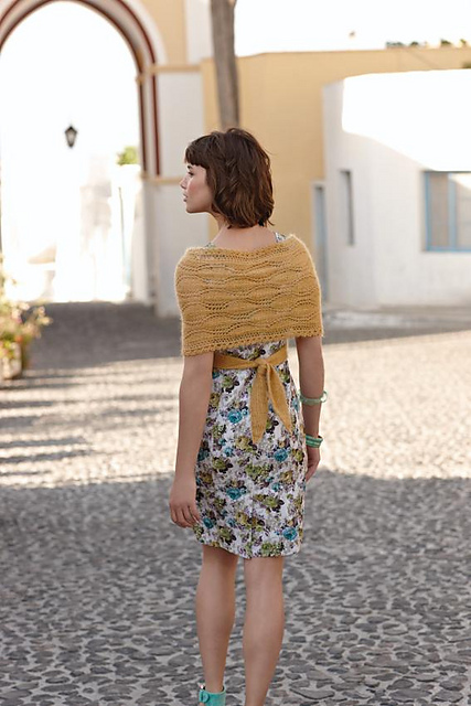


This wrap is one of those pieces I have to try to put my personal preferences aside to try to review fairly, because my first instinct was to snipe that it looked like one of those crocheted ripple-pattern afghans, which isn't fair. This shawl has a sharp, graphic design and drapes well. If you have a modern dress sense and would wear a wrap, go for it.


This top is crocheted, and it's not bad, but it is a very open openwork stitch. You'll probably need to wear something underneath it, and you may not want to do that in summer.


Let's see, a pullover with a stringy front panel that will necessitate the wearing of something underneath, unflattering dropped shoulders and a slight boxiness of shape, and a sleeve-length that matches exactly with and extends the hipline. I'll pass, thanks.


In 1957 dancer and choreographer Paul Taylor stood stock still in total silence on a bare stage for four minutes. Critic Louis Horst subsequently ran a review in Dance Observer that consisted of nine inches of white space. I feel like doing something similar here, because I can barely see the sweater in this pale photo. However, I won't, as I do like the sweater. It has such an interesting construction. It'll be figure-hugging, so make sure you've got the confidence to feel comfortable in it.


Nice cardigan, but do be warned it's not for every figure. You'll need to be small or flat-chested and to have a waistline you don't mind emphasizing for it to be flattering.


I'm a little divided on this lace pullover. It is very oversized, which normally I condemn, but it's also of a delicate and intricate openwork stitch and lightweight enough to not bulk up the wearer. Who would still probably need to have a model's figure to carry it off. And she'll also have to wear a camisole or something underneath. It's a garment that is, while not a failure of design, of very limited wearability.


This striped pullover is definitely an item you'll be able to throw on with a pair of jeans and just feel happy and relaxed in. It has a good, flattering shape and you can have some fun figuring out your own colourway for it. You might even use three colours instead of two, i.e., black and gray for the body and wide stripes of gray with narrow stripes of red for the arms. I find the two blues used here to be a little lacking in imagination and verve.


A very simple, cropped, openwork top. There's nothing wrong with it and it would probably make a handy coverup for the beach, but you'll probably want to wear a layer under it.


Let's see, dropped shoulders, boxy shape, cropped length, horizontal stripes. This pullover has it all. And by "all", I mean, "all the characteristics that can detract from your appearance individually, but when combined will conspire to make you look the worst you've ever looked in a sweater". And wait, there's more! The transparent interstices between the stripes and the off-the-shoulder neckline that will constantly gape at the front and slip off your shoulders will also help rid you of any vestige of dignity. It's a lot to ask of any knitting pattern, but this one is does it all by a mile and still gets aided along its way by the stylist, who paired it with a baggy drawstring jumpsuit. This is a Murphy's law design.


This generic pullover isn't a bad thing of its kind, though I would fix the dropped shoulders, make the sleeves the right length, and add a little waist shaping.


This beaded pullover is pretty, but I would make it the right length. Cropped tops just aren't flattering on anyone. Oh sure, if you've got a model's figure, you can get away with it, but even then wouldn't you rather wear clothes that work in your favour rather than act as a litmus test of your looks? Also, be aware that you'll need to wear something under this item.


The cabled detail on this sweater is sewn on after you've finished knitting it. And it's not unattractive or ineffective, but it does look a little like the result of a drunken collision with some sailboat rigging. If you make this sweater for yourself, be prepared for some America's Cup and/yacht club/sailor jokes, some of which occur to me immediately.


I actually quite like this striped cardigan. Striped sweaters can look juvenile or beginner-ish, but the variation of the stripe width and the sophisticated colourway elevate this to a polished, adult look. I would fix the dropped shoulders and make it waist-length rather than cropped, however.


This striped man's pullover isn't bad, though to me there's something a little discordant about the stripe pattern.


This striped sleeveless top looks like a late-sixties or early-seventies pattern that doesn't quite work as a contemporary piece. The shape isn't flattering and the stripes aren't going to help in that department either.


The pattern on the front of this man's polo sweater is eye-catching and innovative, but the neckline and collar, which are probably supposed to be innovative as well, just look as though the designer couldn't decide which neckline to use, put both on to see how they looked, and then never got around to removing one. I'd make this item with either the v-neck or a regular polo collar and placket, not with both. The pattern on the front automatically makes this sweater really striking and any crazy detailing is just going to put it over the top.


I'm pretty sure I've seen a pattern almost exactly like this in some eighties-era knitting pattern pamphlet. I didn't like it then and I don't like it now. If you want to make this colour-blocked vest, which admittedly isn't a bad shape or badly constructed, I'd recommend making it in a different colourway altogether. These candied/dayglo type colours are just too random and dated-looking to be really attractive.


This Kaffe Fassett top is actually really cute and playful.

Look for Part 2 of the Rowan Knitting & Crochet Magazine issue 53 review tomorrow!

Update: You can view Part 2 here.

Saturday 19 January 2013

Hand-Painted Yarns


I thought I'd like to share my two favourite knitting paintings with you. There are a lot of knitting paintings in existence, perhaps not surprisingly, because knitting was a necessary part of women's daily lives for centuries. Some of the paintings have captured some lovely moments in knitting.

I first saw the painting above at the Art Gallery of Ontario in 2000. It is Les Sabots, painted in 1768 by the French painter François Boucher. The woman depicted here has a figure and colouring not dissimilar from mine (her hair looks more reddish in the original painting than it does in this reproduction), and has taken her knitting along on a picnic only to get a little... distracted, which is totally something I would do. I told the man I was seeing at the time that it was "our" painting, but although he agreed that the parallels were fun, he sniffed that he didn't like pastorals. So the painting became just my painting.


This is another painting that I saw at the AGO, and the original is actually quite large (60" x 40"). It's Gossip, painted in 1888 by a Canadian artist, George Agnew Reid. I love that the spinning wheel is at a standstill and that the knitting is lying idle, because these two women are so intent on their conversation. And we don't know what they're talking about, but it seems a sure bet that it's something really good.

If there's a knitting-themed painting you love, feel free to tell us about it and link to it in the comments.

Friday 18 January 2013

How Men Who Don't Knit See Knitting


This Harry Bliss cartoon from The New Yorker sums up the non-knitting male perspective in a word, doesn't it? Poor insensible darlings.