Thursday 22 August 2013
The Knitter's Curse
"The Knitter's Curse" is a catchy and all-too-true little ditty by The Savoy Ballroom. Unfortunately a number of the examples of "knitting" that appear in the video are actually crochet, but perhaps that's just The Savoy Ballroom going the extra mile to portray a knitter's life as realistically as possible.
Wednesday 21 August 2013
A Tale of Four Hats

It started out so innocently. Violet had always loved hats and wanted little Rose to wear hats, especially in the winter, and pixie hats were in for little girls in the 1940s, they really were. And little girls looked cute in almost everything.

Then, ten years later, because Violet was the kind of mother who would say, "I'm cold just looking at you!", she made her daughter something special for a formal at school, the Sequin Earmuffs pattern from McCall’s Needlework & Crafts Annual, 1952. Violet also made Rose a matching clutch and pumps.

For one Christmas present ten years later Violet made Rose the Pixie Loop Stitch Hat from Bangle Hats, published in 1962. She thought it would evoke all Rose's fond memories of the cones of yarn that always sat in her mother's craft room, and also be the perfect career girl hat.

But then it all seemed to go sour. Rose began to insist on making her own hats, and by the early seventies was sporting numbers like this one. Violet really could not understand where she had gone wrong in teaching her daughter to appreciate fine millinery, and prayed for death so that she might never see what her daughter was wearing on her head by the eighties.
Tuesday 20 August 2013
Casting on and Casting Light

Perhaps you've made yourself a pouf, or bought one of Clare O'Brien's knitted stools or Bauke Knottnerus's Phat Knits, and are looking for a coordinating home furnishing piece to continue the knitting theme. Perhaps you'd like a lamp, but have rejected the knitted lampshade as not being meta enough. Well, in that case, I have a few home lighting ideas for you that represent the actual act of knitting. The Needle Table Lamp from Vitamin Living above being one.

This design is Louisa’s Loup Light, created by Louisa Pacifico. The design is mains operated and is available in various colours and materials.

This is the "Granny Lamp", by Sebastian Errazuriz, which is made of knitted electrical cable. I don't know if it's at all available commercially, and I think if it were to be, Errazuriz would have to consider renaming it.
Monday 19 August 2013
Twist Collective Fall 2013: A Review
Twist Collective has released their Fall 2013 issue, which incidentally is their fifth anniversary issue. And it's a solid issue, with few very designs that I'd consider bad. My one complaint is that there are too many very standard, traditional patterns in this issue, patterns that (although they are perfectly competent and attractive and can't be faulted on their own merits) make me feel like I've seen them before or even recognize as a near replica of a pattern I already own. But let's have a look at the designs.

These are the Perfect Storm mittens. They're cute and innovative. I like the stylized wave design and storm-tossed sailboat.

The High Street cardigan is a nice, serviceable design.

The Vinland hat and mittens set are quite eye catching.

The Bosun pattern, which is otherwise a no-frills cardigan, manages to look quite innovative with the simple use of an all-over chevron pattern. I like it, and I especially like that the designer has taken the trouble to connect the chevrons on the top of the sleeve with the chevrons on the body of the sweater. Nice work!

The Ossel design is a fairly standard cable pattern dress, and not a terribly flattering one, though it looks warm and comfy.

The Trigonometric socks pattern is cute. The squiggles make a nice change from the usual cables.

I can't say I care for the boxy Sarannis jacket. It's not going to look good worn open, and it doesn't look all that good buttoned.

I do rather like the Bevel pullover, though I know I could never wear it — with that empire-like lines created by the stitchwork over the chest, it's not for the well-endowed woman.

The Ballast pattern is a lovely little tam and fingerless gloves set.

The Doverfell design is a goodie basic hoodie pattern with a bit of textural interest down the front. Do try to match the zipper better than has been done in this sample, though. The black one looks rather baldly utilitarian here.
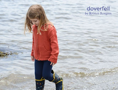
The Doverfell design scaled down to a child's version. It works equally well in a smaller size.

The Farthingale is a wearable pullover with some interesting detail. The lacing effect on the sleeves and sides really stands out.

I like the Zigreta pullover, though I'm not sure the little split in the ribbing of the neckline is adding anything. The sweater is interesting enough without it, and it just seems like a distracting detail. It can be easily not included if you feel the same way.
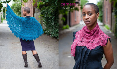
The Cemara shawl is a gorgeous pattern, and it comes with three size options so that you can make a shawl to be worn in the way you like best. I seem to recall that Twist Collective has offered shawl size options in previous issues that I've reviewed, and it's a great idea.

The Charette design is a good example of a very traditional design. Women have been wearing sweaters very like this one for the last century.

The Periphery Shawl is another attractive and intricate lace shawl.

The Hawser pullover is another fairly standard but nice design.
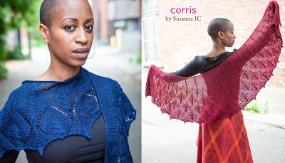
The Cerris is another beautiful shawl with directions for knitting it in two different sizes. The elongated shape gives it a slightly different air than the usual shawl.

The Rafters design is another very traditional pattern, this time for a basic cabled cardigan. I must admit I do like a shawl collar, and this one sits very well.

The Morel hat and scarf is another competent and attractive yet quite standard design.

Ah, finally something that's a bit fresh and different. The Couronne cardigan is really cute. Great use of a variegated yarn, and having the floral motif run along the side seams is a really nice touch. I have my suspicions that this sweater might look a little shapeless through the lower body, but if that's the case you can always add a little waist shaping.

The Literati design is another very standard cardigan.

Very much like the Silverstone henley. The flattened-out cables are an interesting and unusual texture, and that's a good button choice that really elevates the whole sweater.

The Foxcroft design is another quite traditional pattern, though there are a few little unusual choices made here: the very open shawl collar and the broken lattice cable pattern on the front.

The Svanhild turtleneck is another traditional style, though I will say it's a stellar example of its kind. That cabled texture is beautifully intricate.

The Apple Catchers mittens are another basic pattern, although with very long wrists and very square tips. I wouldn't make them quite that long and I'd find a way to shape them more gracefully around the fingertips. They just look crude this way.

I love the two-tone patchwork effect of the Sweetspire shawl, though I can't say I personally care at all for the colours used here.

The Greystone shawl is beautifully textured, but I've got my concerns about its shape. How is that very long end going to look when it's actually on the wearer rather than flapping in the breeze?

The Topside pattern may have been so named to get your mind off how bottom heavy you're going to look in this sweater. This design is not only unflattering but just plain awkward looking.

The Gentian mittens design is just so pretty.

Love the graceful lacework in the Conflux sock pattern.

The Parure cardigan is quite attractive, though it's again fairly standard. I think I might take the cuffs in a slightly different direction if I were to knit this, either making narrower bands of pattern or copying the entire yoke pattern into the cuff band. They look a little out of proportion to me as they are.
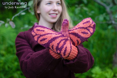
The Underwing pattern is kind of neat, like a high-concept rendering of a butterfly, but I would so not make them in these Barbie's Dream House colours.

I was going to say I loved the detail on the front of the Hardanger jacket but didn't care for the shaping. Then I realized that the shaping is fine, but this beautiful, striking jacket has been victimized by some random, drive-by styling. This jacket is a statement piece and does not belong over a gathered calf-length skirt in hot pink. I'd put it over a tailored skirt or trousers in a neutral or dark solid colour, or even jeans. Just something simple and unobtrusive, at any rate.

The Penta shawl is lovely, with a more modern geometric textured look instead of the usual lace and cables.
Sunday 18 August 2013
Interweave Knits Fall 2013: A Review
The Interweave Knits Fall 2013 issue is out. Despite several missteps, this issue has some first-rate designs in it, and there are at least four I want to make, so although I don't buy many knitting magazines, I'm going to buy this one. Let's have a look at the 24 designs in it, shall we?

And we begin very well with the Barnard Raglan. I haven't a nit to pick where this one is concerned. The ballet neckline and the cable detailing give this sweater flattering lines and visual interest. This is a simple yet distinctive sweater most women could wear just about anywhere.

The Bryn Mawr Dress is another good design. I think some women might want to make it with a little more ease and/or lower the neckline and/or change the length of the sleeves, but as long as it suits you it's a good design as is. Love the texture.

The Clear Creek Pullover is another simple, flattering pattern with just the right amount of detail to catch the eye. I'm not sure I'd want to wear a strappy top underneath it, but that may just be me. I've linked to the pattern page on Ravelry for now because the link in Interweave's preview page isn't working.

The Nexus Cowl is another pattern I like. I wonder if that cowl is long enough to double around the neck? If it isn't, I would make it long enough to do so because it's such a bonus to have that second wearing option with a cowl. And that's some standout stitchwork there, but did anyone else do a slight double take when he or she first saw it because it looked a little like interlocked skeletal hands?

The Seven Sisters Pullover is another good, wearable, and simple yet interesting design. I am especially loving the ballet necklines in this issue, which are so flattering and yet seem to occur relatively rarely in knitwear.

The Crinoline Tee is really basic, but it's a competent, wearable design and would be a good way to showcase a beautiful yarn in a colour you really love.

The Permanent Way Cape. I'm not a fan of capes, but I must admit this is a good example of one, and has been constructed with considerable skill and care.

I do like a glove with an elongated cuff because it's so much warmer and more comfortable to never have any wrist bared to a Toronto winter, but the Ballast Gloves are a little longer than I would like. One usually puts on one's coat before one's gloves, and with these one will either have to reverse that order or wind up awkwardly stuffing the arm of the glove up one's coat sleeve. They can be made shorter, of course, and other than that one concern these really are well-designed. Love the detail on the back of the hands.

This is the Surrey Jacket, and I can't say I'm taken with it. There isn't a photo of it done completely up, and it just looks awkward and ill-fitting when worn open. Someone needs to figure out a way to make double-breasted styles look good when worn unfastened.

Love the Minstral Scarf, which is just ever so ethereal and lovely. It will catch on everything, it won't provide any significant warmth, but who cares. Sometimes it's enough for an item just to be aesthetically pleasing.

This is the No. 6 Shrug, and I can't say I consider it a successful design. It just looks awkward and as though the model is trying on an unfinished part of a sweater for size.


The Haberdashery Cowl isn't bad. I'm not crazy about the colourway, which is a little on the dreary side, and it doesn't look all that good worn unbuttoned — the buttons and loops are just hanging there looking untidy and useless in the "open" shot.

The Concord Jacket is well-designed, and it's attractive, but that is one trying fit that will not flatter most women. Cardigans that don't meet in the front just tend to look too small.

Quite like the Rheinfels Mittens. I'd be inclined to whip up a hat to go with the mittens, or at least carefully choose their colourway to go with my coat. I think they'd look better when visually tied to something else than they do as a one-off.

The Trieste Cardigan is a really darling baby cardigan. It's simple yet has such style, and it's so carefully finished.

The Plowman Cardigan is something a bit different, but it works. The garter shawl collar and belt work really well, and the arrow intarsia motifs are strikingly graphic.

The Epeiric Vest is an excellent design with an elegantly understated colourway and is a very worthy addition to the long and lovely Fair Isle sweater tradition, but I will say that this sample has one major flaw. The v-neck was very poorly done and it's distorting the design — those horizontal design bands should all run straight across the chest. If you make this sweater, either pick up more stitches for the neckband than this knitter has done or don't cut the neck so low that it needs such a deep v-neck.

Love the Dressage Cap, but I will warn you to take care to make the cap's visor wide enough to suit the wearer, which is to say it should be a touch wider than her face. You can see here that the visor is narrower than the width of the model's face, and it's not doing her any favours.

Love the Cornhusk Pullover. The use of gradient colour and the eyelet cables is just inspired and a perfect blending and balance of two striking design elements. Those three-quarter length sleeves aren't for every woman, but there's no reason they can't be lengthened or shortened to suit the intended wearer.

I do really like the drop lace stitch shoulder detail on the Prisma Dolman, but I can't say I care for anything else about this design. The visible seams and rolling hems aren't really working here and just make it look crude and unfinished.

The Converge Pullover isn't really working either. It looks like a beginner knitting project with some glaring mistakes in it.

I do quite like the Filtered Pullover. The dropped stitch bands really work here, setting up an interesting contrast to the cables. The cropped length isn't for everyone, but the sweater can be easily lengthened.

The Corrugated Tunic isn't without a certain aesthetic interest, but man, this is one seriously unflattering item. Even the model isn't working it, but is gazing off to the side with a "Why am I wearing the same look as the wall I'm leaning against?" expression. If you really want the effect the Corrugated Tunic will create, save yourself the knitting time and don a Corrugated Box.


I do not know why the designer of the Joan of Arc Sweater saw fit to add saddlebags to what would otherwise have been a perfectly nice cabled pullover, but it wasn't a happy thought.

And we begin very well with the Barnard Raglan. I haven't a nit to pick where this one is concerned. The ballet neckline and the cable detailing give this sweater flattering lines and visual interest. This is a simple yet distinctive sweater most women could wear just about anywhere.

The Bryn Mawr Dress is another good design. I think some women might want to make it with a little more ease and/or lower the neckline and/or change the length of the sleeves, but as long as it suits you it's a good design as is. Love the texture.
The Clear Creek Pullover is another simple, flattering pattern with just the right amount of detail to catch the eye. I'm not sure I'd want to wear a strappy top underneath it, but that may just be me. I've linked to the pattern page on Ravelry for now because the link in Interweave's preview page isn't working.

The Nexus Cowl is another pattern I like. I wonder if that cowl is long enough to double around the neck? If it isn't, I would make it long enough to do so because it's such a bonus to have that second wearing option with a cowl. And that's some standout stitchwork there, but did anyone else do a slight double take when he or she first saw it because it looked a little like interlocked skeletal hands?

The Seven Sisters Pullover is another good, wearable, and simple yet interesting design. I am especially loving the ballet necklines in this issue, which are so flattering and yet seem to occur relatively rarely in knitwear.

The Crinoline Tee is really basic, but it's a competent, wearable design and would be a good way to showcase a beautiful yarn in a colour you really love.

The Permanent Way Cape. I'm not a fan of capes, but I must admit this is a good example of one, and has been constructed with considerable skill and care.

I do like a glove with an elongated cuff because it's so much warmer and more comfortable to never have any wrist bared to a Toronto winter, but the Ballast Gloves are a little longer than I would like. One usually puts on one's coat before one's gloves, and with these one will either have to reverse that order or wind up awkwardly stuffing the arm of the glove up one's coat sleeve. They can be made shorter, of course, and other than that one concern these really are well-designed. Love the detail on the back of the hands.

This is the Surrey Jacket, and I can't say I'm taken with it. There isn't a photo of it done completely up, and it just looks awkward and ill-fitting when worn open. Someone needs to figure out a way to make double-breasted styles look good when worn unfastened.

Love the Minstral Scarf, which is just ever so ethereal and lovely. It will catch on everything, it won't provide any significant warmth, but who cares. Sometimes it's enough for an item just to be aesthetically pleasing.

This is the No. 6 Shrug, and I can't say I consider it a successful design. It just looks awkward and as though the model is trying on an unfinished part of a sweater for size.


The Haberdashery Cowl isn't bad. I'm not crazy about the colourway, which is a little on the dreary side, and it doesn't look all that good worn unbuttoned — the buttons and loops are just hanging there looking untidy and useless in the "open" shot.

The Concord Jacket is well-designed, and it's attractive, but that is one trying fit that will not flatter most women. Cardigans that don't meet in the front just tend to look too small.

Quite like the Rheinfels Mittens. I'd be inclined to whip up a hat to go with the mittens, or at least carefully choose their colourway to go with my coat. I think they'd look better when visually tied to something else than they do as a one-off.

The Trieste Cardigan is a really darling baby cardigan. It's simple yet has such style, and it's so carefully finished.

The Plowman Cardigan is something a bit different, but it works. The garter shawl collar and belt work really well, and the arrow intarsia motifs are strikingly graphic.

The Epeiric Vest is an excellent design with an elegantly understated colourway and is a very worthy addition to the long and lovely Fair Isle sweater tradition, but I will say that this sample has one major flaw. The v-neck was very poorly done and it's distorting the design — those horizontal design bands should all run straight across the chest. If you make this sweater, either pick up more stitches for the neckband than this knitter has done or don't cut the neck so low that it needs such a deep v-neck.

Love the Dressage Cap, but I will warn you to take care to make the cap's visor wide enough to suit the wearer, which is to say it should be a touch wider than her face. You can see here that the visor is narrower than the width of the model's face, and it's not doing her any favours.

Love the Cornhusk Pullover. The use of gradient colour and the eyelet cables is just inspired and a perfect blending and balance of two striking design elements. Those three-quarter length sleeves aren't for every woman, but there's no reason they can't be lengthened or shortened to suit the intended wearer.

I do really like the drop lace stitch shoulder detail on the Prisma Dolman, but I can't say I care for anything else about this design. The visible seams and rolling hems aren't really working here and just make it look crude and unfinished.

The Converge Pullover isn't really working either. It looks like a beginner knitting project with some glaring mistakes in it.

I do quite like the Filtered Pullover. The dropped stitch bands really work here, setting up an interesting contrast to the cables. The cropped length isn't for everyone, but the sweater can be easily lengthened.

The Corrugated Tunic isn't without a certain aesthetic interest, but man, this is one seriously unflattering item. Even the model isn't working it, but is gazing off to the side with a "Why am I wearing the same look as the wall I'm leaning against?" expression. If you really want the effect the Corrugated Tunic will create, save yourself the knitting time and don a Corrugated Box.


I do not know why the designer of the Joan of Arc Sweater saw fit to add saddlebags to what would otherwise have been a perfectly nice cabled pullover, but it wasn't a happy thought.
Subscribe to:
Posts (Atom)