Wednesday 29 January 2014
Yankel's Gift
Here's a hand knitted and hand sewn stop animation video called Yankel's Gift, which is about a little boy and his books. This video was made and edited by Emily Peterson Dunne, written by Molly Auerbach, and voiced by Molly Auerbach and Grace Pak, with music by Elliott Smith. The production was filmed at Sarah Lawrence College in 2009.
Monday 27 January 2014
Knit Under Your Plaidie

Robbie Burns Day just passed us two days ago, so what do you say to a post of selected knitted plaid patterns? Ah, something about the "best plaid plans of mice and men" in a stage Scottish burr? Fantastic. But let's get on with the patterns. Bear with me while I make bad Scottish jokes. My surname may be Scottish (the real one, not Swan), but I'm actually only 1/32 Scottish.
Lead on with the Macduff tartan bag, by Judy Furlong. This pattern is available for $3.00(USD).
Love this simple yet distinctive Plaid Baby Blanket, by Yana Ivey. It's a free pattern.

These are the Plaid Play socks, by Camille Chang. This pattern is available for $1.99(USD).

If you'd like to sport just a touch of plaid, the Mad About Plaid Socks by fkd designs might be a good fit. This pattern is available as a free Ravelry download.

Another pair of plaid socks. Love the offbeat colourway. Mad For Plaid socks, by Kate Atherley. This is a Knitty pattern and therefore available for free.

Here's one for the boys. The Plaid Pullover, by Bruce Weinstein. This pattern was published in Boyfriend Sweaters: 19 Designs for Him That You'll Want to Wear

These are the perfect thing to wear when you're eating a wee bit of bannock bread by the fire. The Plaid Loafers, by Katie Startzman. This pattern was published in The Knitted Slipper Book: Slippers and House Shoes for the Entire Family

A rather fetching Plaid Tam, by Theresa Schabes. This pattern was published in Vogue® Knitting: The Ultimate Hat Book: History * Technique * Design

I had to include this one, even though the pattern will be at best a challenge to find. This is Plaid Coat #6077, by Spinnerin, which was originally published in Spinnerin 150, Bulky Classics, in 1961. This is knitted in mohair, and in a sharp colourway it will be quite the statement piece.

Cute little Girl's Plaid Dress, by Melissa Leapman. This pattern is available for free.

Here's a smart hat and mitten set. The Chillaxin' Plaid Hat and Mitten, by Lorilee Beltman. This pattern is available for $7.00(USD).

Love this little number. Laura’s Cardigan, by Annie Modesitt. This pattern is available for $5.50(USD).

The colours of this piece are gorgeous. The Tartan Jacket, by Teva Durham. This pattern is available for $5.50(USD).
Friday 24 January 2014
Where the Nodding Violets Grow
A stop animation video about the process of getting wool from sheep to sweater. As you will see, the process depicted here isn't exactly accurate, but it's kind of fun to see wool production and knitting acted out by Lego people anyway.
Wednesday 22 January 2014
Rowan Knitting and Crochet Magazine Issue 55: A Review, Part 2
Let's look at the second half of the patterns from Rowan Knitting and Crochet Magazine's Issue 55, since we looked at the first half of its patterns on Monday.

The Wharf design. I rather like this smart, casual sweater. If you don't care to show any midriff or this is too fitted for you, it could be easily made a little longer and looser.

Not a fan of the Boardwalk design, which seems better suited to a little girl or a Muppet than a grown woman. Nothing against little girls or Muppets, you understand.

The Sailor design is another smart casual look. And it's well-styled here. A cute striped skirt like this one combined with this top will make the perfect easy, wearable summer outfit.

Very much like the Celeste design. The stripes are fresh and cute and fun in an adult fashion rather than in a Muppet-appropriate way. NOT MUPPET-IST.

The Buoy design. This is pretty run-of-the-mill design, adequate and wearable without being notable in any way.

Not crazy about the juxtaposition of the stripes and lace in the Port design — they're just not working together as they should. I'd make that waistband plain stockinette in the main colour.
The Surf design is another Muppet-suitable look. I'm being too hard on this one, probably, because maybe a lot of people would think it cute and fun, but those ripple patterns always look too afghan-like to me.

The Cove design. Hmm, a striped t-shirt with a peplum. I'm surprised to find myself typing that I actually kind of like this one. It is a very young woman's style, but I can see it looking cute on a teenager or early twentysomething.

The Sally design is another cute striped number that a grown up can wear. I wish designers would work with vertical stripes more often. They are just as sharp and so much more flattering than horizontal stripes.

The Driftwood pattern. Rowan has really gone to town on stripes in this issue. This one isn't bad, but I would fix the dropped shoulders, make it long enough to cover my stomach, and go with another colourway. This one looks just too Christmassy for a cotton sweater. Unless of course you live in Australia where it's warm at Christmas.

The Pier design. This is another cute little top. Again, if you wouldn't be comfortable in something this short and fitted, it can always be made longer and wider.

The Promenade design. SO MANY STRIPES. The stripes are done in an interesting way and the sweater is well-shaped, at least, so that the overall look is good.

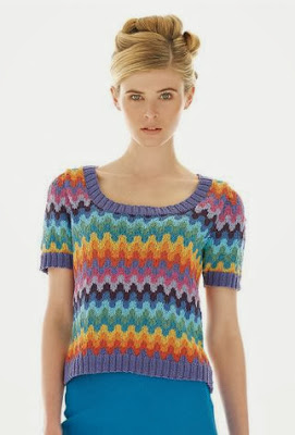
The Gift design. This one isn't bad, though I think it does call out for some tweaking. I'd fix the dropped shoulder and put a bit of ribbing along the bottom of the body. The hem here doesn't look finished.

The Divinity design is a rather nice, simple little top.

The Sierra Wrap. Not a fan of this, which looks a little rough and ready and awkward in shape.

The Chiquitta design. This is afghan-like and very unflattering (admittedly, those two qualities do tend to go hand-in-glove in knitwear). It's never a good sign when the model is shown from a angle rather than full frontal.

The Shore pattern. Another very decent striped pullover.

The Azerbaijan design. I knew this was a Kaffe Fassett as soon as I looked at. As always Fassett's colourwork is distinctive and masterful, but his shaping can be difficult to carry off. If I were making this for an intended wearer who does not have a model-type figure, I'd reshape the item to be standard fit with a cap sleeve.

The Belarus design. The colourwork here is GORGEOUS, but I'd be doing some reshaping of the body of this cardigan, which looks too big and unstructured to flatter most wearers.

The Estonia design. Another Kaffe Fassett design. This one is actually quite well shaped, though you might wish to make it longer and looser than it appears here.

The Latvia design. The only change I'd make to this one would be to make it in some non-pastel colourway, but that's personal preference rather than because there's anything wrong with this palette.

The Lithuania design. This one's sharp and wearable. Though I would not put it with those pants.

The Slovenia design. Love this one as is, although it does appear to be a little long for this (probably tall) model. That's easily remedied, though.

The Moldova design. I see even Kaffe Fassett has climbed aboard the stripe train. Not bad, but I would neaten up the fit and shorten those sleeves a little. That just above the elbow length tends to look dowdy, particularly when it's loose fitting.

The Adella design looks like an afghan with sleeves. It's all bunchy in the back and none too flattering in the front. Afghans really only belong on couches.

The Wharf design. I rather like this smart, casual sweater. If you don't care to show any midriff or this is too fitted for you, it could be easily made a little longer and looser.

Not a fan of the Boardwalk design, which seems better suited to a little girl or a Muppet than a grown woman. Nothing against little girls or Muppets, you understand.

The Sailor design is another smart casual look. And it's well-styled here. A cute striped skirt like this one combined with this top will make the perfect easy, wearable summer outfit.

Very much like the Celeste design. The stripes are fresh and cute and fun in an adult fashion rather than in a Muppet-appropriate way. NOT MUPPET-IST.

The Buoy design. This is pretty run-of-the-mill design, adequate and wearable without being notable in any way.

Not crazy about the juxtaposition of the stripes and lace in the Port design — they're just not working together as they should. I'd make that waistband plain stockinette in the main colour.

The Surf design is another Muppet-suitable look. I'm being too hard on this one, probably, because maybe a lot of people would think it cute and fun, but those ripple patterns always look too afghan-like to me.

The Cove design. Hmm, a striped t-shirt with a peplum. I'm surprised to find myself typing that I actually kind of like this one. It is a very young woman's style, but I can see it looking cute on a teenager or early twentysomething.

The Sally design is another cute striped number that a grown up can wear. I wish designers would work with vertical stripes more often. They are just as sharp and so much more flattering than horizontal stripes.

The Driftwood pattern. Rowan has really gone to town on stripes in this issue. This one isn't bad, but I would fix the dropped shoulders, make it long enough to cover my stomach, and go with another colourway. This one looks just too Christmassy for a cotton sweater. Unless of course you live in Australia where it's warm at Christmas.

The Pier design. This is another cute little top. Again, if you wouldn't be comfortable in something this short and fitted, it can always be made longer and wider.

The Promenade design. SO MANY STRIPES. The stripes are done in an interesting way and the sweater is well-shaped, at least, so that the overall look is good.

The Gift design. This one isn't bad, though I think it does call out for some tweaking. I'd fix the dropped shoulder and put a bit of ribbing along the bottom of the body. The hem here doesn't look finished.

The Divinity design is a rather nice, simple little top.

The Sierra Wrap. Not a fan of this, which looks a little rough and ready and awkward in shape.

The Chiquitta design. This is afghan-like and very unflattering (admittedly, those two qualities do tend to go hand-in-glove in knitwear). It's never a good sign when the model is shown from a angle rather than full frontal.

The Shore pattern. Another very decent striped pullover.

The Azerbaijan design. I knew this was a Kaffe Fassett as soon as I looked at. As always Fassett's colourwork is distinctive and masterful, but his shaping can be difficult to carry off. If I were making this for an intended wearer who does not have a model-type figure, I'd reshape the item to be standard fit with a cap sleeve.

The Belarus design. The colourwork here is GORGEOUS, but I'd be doing some reshaping of the body of this cardigan, which looks too big and unstructured to flatter most wearers.

The Estonia design. Another Kaffe Fassett design. This one is actually quite well shaped, though you might wish to make it longer and looser than it appears here.

The Latvia design. The only change I'd make to this one would be to make it in some non-pastel colourway, but that's personal preference rather than because there's anything wrong with this palette.

The Lithuania design. This one's sharp and wearable. Though I would not put it with those pants.

The Slovenia design. Love this one as is, although it does appear to be a little long for this (probably tall) model. That's easily remedied, though.

The Moldova design. I see even Kaffe Fassett has climbed aboard the stripe train. Not bad, but I would neaten up the fit and shorten those sleeves a little. That just above the elbow length tends to look dowdy, particularly when it's loose fitting.

The Adella design looks like an afghan with sleeves. It's all bunchy in the back and none too flattering in the front. Afghans really only belong on couches.
Monday 20 January 2014
Rowan Knitting and Crochet Magazine 55: A Review, Part 1
Rowan Knitting and Crochet Magazine Issue 55 is out. Let's have a look at the first half of the patterns today and the second half on Wednesday.

The Praise design. The lace is very pretty and I like the subtle colour shading, but the overall lines of this item bring the expression "sadsack" to mind. I'd neaten up the shaping if I were making this.

The Mercy design. Hmm, a drape front cardi. It's not a bad thing of its kind. I can't wear this kind of unstructured design myself, so I have a bias against it, but it is the kind of thing that can look attractive on and be useful to the right person.

The Hope design. I rather like this one, which with its lacy texture and slightly contrasting arm, neck and waistbands, manages to be more interesting than you would expect of something the colour of oatmeal. But I would not pair it with a gathered skirt, which as you can see here is conspiring with the waistband to do no good even to this professional model.

The Trinity design. A lace poncho with... a train. Or whatever all that excess knitting at the back is. The only reason this looks vaguely attractive is that it's Kidsilk Haze, which always looks luscious, and the lace pattern is lovely. But the shaping is ridiculous.

The Genesis design. I rather like this one, which could be a pretty summer cover-up and a nice alternative to a shawl.

The Prudence design. Cute and pretty little top.

The Rhapsody design. Don't care for this one. The hourglass shape on the front isn't a bad concept, but the execution just looks crude, as though it were a mistake.

The Bliss design. Very pretty lace scarf.

The Harmony design. I'm not enthusiastic about this one. Well, it's crocheted (and I am hardly ever enthusiastic about crochet), but aside from that I don't care for the tiered look. This isn't flattering and will make whoever wears it look like a lampshade.

The Loudres design. Love the delicate charm of this one.

The Deva design. Beautiful lace, beautiful yarn... but this is another sack-like design. Even lovely lace like this needs to be shaped like a garment rather than a bag.

The Madonna design. Dropped shoulders, horizontal stripes and tunic shaping add up to one unflattering sweater. Which is a shame, because the texture in those stripes really is something special.

The Promise design is really lovely except for that butt sling shaping in the back. I would so omit that.

The Julieta design. This is a Kaffe Fassett piece, and though the colourwork is as lovely as his always is... the shaping isn't great, and the combination of horizontal lines with this shaping isn't a well-advised one. Note that Rowan didn't use a full frontal photograph of this piece. I'd be inclined to use this design's masterfully subtle striped colour for another pattern altogether.

The Filippe design. This is basic but adequate design. The lines are good and the colours chosen work together well.

The Dia design. This is one of those designs that didn't get where it deserved to go. The patterned yoke and texture used throughout the body are interesting and attractive, but the dropped shoulders, boxy shape, and unfinsihed-looking hem are really detracting. Fix the dropped shoulders, add waist-shaping and a ribbed waistband to the body, and you'll really have something.

The Eldora design. This is attractive and interesting, but I would want to neaten up the shape and fit a little bit.

The Alma design. This is an offbeat colourway and texture that I think actually really works, but again I would tidy up the shape and fit. See how big that armhole is on the left? Everyone is going to have an excellent sideshow view of the wearer's bra and more.

The Crista design. Not wild about the texture on this one. It looks too much like the wrong side of an elasticized material. And this is a design that's doing even this lovely model no favours.

The Estefan design. Not thrilled with the colourway here, but I think the design would be fairly effective in, say, black, charcoal and light gray.

The Fernando design. This is actually pretty gorgeous, though I'm not sure too many of the men of my acquaintance would care to wear it. If you're making this for a man (and you aren't the man it's for), I'd get his approval first.

The Esperanza design. Rowan really seems to have thing for horizontal stripes all of sudden. This pattern doesn't look too bad here on a professional model, but it will be about as flattering as an awning on most women.

The Madia design. Oh man. A lot of sweaters are unflattering while being quite lovely articles in themselves, but this is not one of those sweaters. It's cropped and boxy with cropped sleeves that create a most unkind horizontal line, and the texture is horrible, as though the sweater were infested with worms. Let's just move along quickly and pretend this never happened as best we can.

The Guido design. Quite like this one, which takes the man's striped sweater to a new level with its subtle colourway and gradient effect.
Subscribe to:
Posts (Atom)