
Today we're going to look at the second half of the patterns in Bergère de France Magazine 181, the first half of the review having been posted two days ago. Hold on to your needles, knitters. The first half of this magazine was a bumpy ride and the second half isn't much of an improvement.

Pattern #25, Crochet Beanie. This, I am relieved to say, is a quite presentable and even cute hat.

Pattern #26, Cable Beanie. This hat isn't too bad, but those running stitches in ribbing need to go. I'd have put in some sort of stripe instead.

Pattern #27, Crochet Snood. Nice piece, if it is perhaps slightly too large scale for some women. However, that's easily corrected.

Pattern #28, Fluffy Snood. This would prove a cheering pop of colour as well as a warm, practical accessory on a bleak, cold day.


Patterns #29, Snood; 30, Fluffy Snood; 31, Large Snood, 32, Large Snood. And here we have a snaggle of snoods. These are very basic, but should be quite useful and even attractive if done in a good quality yarn in a beautiful colour.


Patterns #33, Bag with a Man's Face; and 34, Bag with a Woman's Face. These look like they were designed by an eight-year-old. To what adult mind do these look like good representations of male and female human faces? They look more like doodles of cats done up in stupid accessories, and the stitching around the faux leather top and bottom looks crude and unattractive in both samples. I think the faux leather bag kit that Bergère de France is trying to sell looks like a pretty decent product, but Bergère de France isn't doing themselves any favours by sabotaging their product's potential in this way.
 ;
; ;
; ;
; .
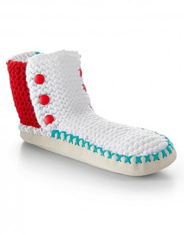
.Patterns #35, Italy Slipper Socks; 36, Germany Slipper Socks; 37, Spain Slipper Socks; and 38, France Slipper Socks. I'm not liking these. They look crudely put together, and the flag theme isn't a particularly happy choice.

Pattern #39, Throw. This isn't terrible, but it isn't great either. Design really ought to involve some effort on the part of the designer.

Patterns #40, Super-Sized Cushion; and 41, Knitted iPad Mini Case. I'm really not getting why the Bergère de France staff think crude-looking embroidery constitutes an embellishment.

Pattern #42, Flag Hanging Pockets. This is tacky, and I'm not getting the thinking behind teaming up flags from the U.S., Laos, the U.K., and Iceland. Maybe it's meant to subtly express French scorn of their national cuisines....?

Pattern #43, Hello Hanging Pockets. I could see this hanging pocket idea working in a child's bedroom, a play room, a craft room, or a mud room, but even then I would want a better designed, more attractive version than this one.

Pattern #44, Oversized Pouffe. A dead simple garter stitch floor pillow isn't a bad idea, but I shouldn't think anyone would need a pattern for one.

Pattern #45, Shoulder Cape. Very presentable basic capelet. The only criticism I have of it is that it doesn't entirely hide the horror that lies beneath it, and that is probably not a fair expectation.

Pattern #46, Round Neck Sweater. Seriously, Bergère de France? Your staffers were presented with a slightly too plain colour-blocked sweater that needed a little something more on it, and their response was... to sketch a bizarre pursed lip expression on it? The mind. It is so blown. But then maybe that was the point.


