
Knit Simple has released its Fall 2016 issue. Let's have a look at it, shall we?


I like knitted slippers, but it can be difficult to find slipper patterns with a bit of style to them. So many knitted slippers look so clumsy and shapeless. Of this set of four, the striped slippers are rather sporty and fun, and the bunny slippers are fairly cute, but the orange slippers and the raspberry slippers with the fold-over tops have that clumsy look, and the orange ones especially look like something you'd find on a Hobbit.


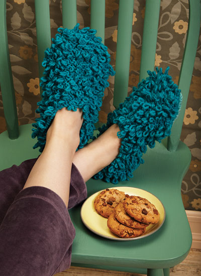
Of these four pairs, I like the oatmeal ones with the burgundy trim. They're simple but a little finishing detail went a long way. The variegated ones have a great yarn but no effort was made to give them any style or interest, the pointy-toed purple ones look a little too elf-like, and the blue loopy ones would be great for those weeks when you didn't get around to Swiffering your floors but aren't so great from a style perspective.


Wool-trimmed flip flops seem contradictory in terms to me: if the temperature is high enough that you can wear flip flops, do you want wool on your feet? I'd suggest doing these in a cotton at least. The snowflake pair of slippers aren't bad.

Eyelets combined with an interesting yarn is all this scarf needs.

This is one of those simple pieces that are perfect for showcasing a beautiful yarn. A good shape and the bisecting line of dropped stitches keep it looking polished.

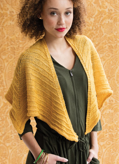
This wrap is easily my favourite design of the whole issue. It's relatively simple, but is ever so smart and stylish, and it sits so beautifully.
Basic, but certainly adequate.

The combination of garter ridges and lacework is interesting. There are better yarns for this pattern than this one.


The scarves aren't bad. The gray, white, blue, and red hat looks like it was knitted up of some random scraps. The football looks silly on an otherwise decent hat. The bow hat would look better in colours that worked well together.

This isn't bad, though the colour changes aren't going to have the same look on the other side. I like the idea of putting the child's initials on the blanket.


I like the owl pullover quite a lot, but the raccoon is weirding me out.

These pieces look like a good companion piece for the Swiffer slippers, because if your daughter is wearing this, you can turn her upside down and use her to get those hard-to-reach spots. Slightly more seriously, I do like the capelet, but that lion hat is going to make everyone wonder what on earth happened to the little girl's hair.

This one's a bit better than the last one, but I'm still not sold on the hat. The capelet and the mitts are cute.

The monochromatic colour scheme of this afghan really makes it.

A very good scrap yarn project -- which is to say it looks like a design rather than something made out of odd and ends of yarn.

Quite a handsome piece.

I'd never thought of knitting flower pot covers, but I have to admit these look good. They'd be a nice way to hide a flower pot that's ugly or that doesn't go with your decor. They will get dirty but that's what washing machines are for.

Very basic, but it would look very well if done in a beautiful yarn.

Classic turtleneck with a good shape. You can't go wrong with this one, unless, like me, you don't have the neck length for a turtleneck.

Not bad. The stitchwork is really interesting. I'd raise the dropped shoulders.

This one needs a more interesting yarn to make it work.

A good-looking and eye-catching scarf.


