
Noro Magazine Issue 14 is out. Let's have a look at it, shall we?

Pattern #01, Raglan Sleeve Top. Love the colourway; would neaten up the fit considerably.

Pattern #02, Simple Ruana. An opening in the centre of a beach blanket does not a wearable item make.

Pattern #03, Crochet Dress. This is one of those designs that, at first glance, I think I'll pan, but wind up liking upon closer study. This one requires an underlayer, of course, which makes it not so wearable as a summer dress, but it would make a cute beach coverup.

Pattern #04, Sleeveless Hoodie. The colour's a little dreary, but the lines are good.
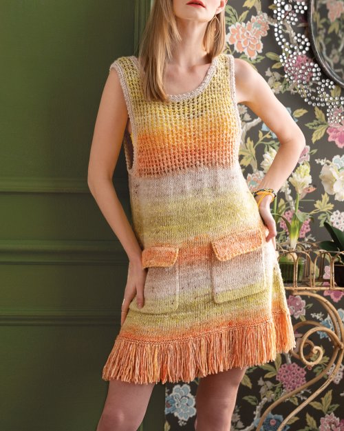
Pattern #05, Fringed Dress. I'm looking at the mesh bodice, flap pockets, and fringed hem, and thinking that they really do not belong on the same dress because they don't work together at all. Pick your least favourite and second least favourite of those three features (protip: one of those items should be the flaps on the pockets), eliminate them, and let the third design element carry the dress.

Pattern #06, Triangular Shawl. This needs an edging of some kind as it looks a little unfinished as is.

Pattern #07, Origami Shawl. Beautiful wrap.

Pattern #08, Offset Cable Tee. Nice top which the styling isn't doing any favours -- all the other details are simply distracting. If I were to style an outfit around a piece made from Noro, I'd let the Noro item do the talking.

Pattern #09, Dropped Shoulder Tee. Cute, but I'd scale back the sizing to a relaxed fit.

Pattern #10, Tank Top. Delicately pretty.

Pattern #11, Round-Yoke Top. Not bad. I'd lengthen this, as cropped length tops flatter very few women.

Pattern #12, Raglan Poncho. I'm a hard sell on ponchos, but this one has good shaping and sits well.

Pattern #13, Honeycomb Stitch Top. Nice lines and stitchwork.

Pattern #14, Brioche T-Shirt. I rather like the idea of an off-the-shoulder neckline and the ruffles at the end of the sleeves, but I would neaten up the fit a good bit.

Pattern #15, Brioche Tank Top. I like the straps but this looks so square through the bodice. I'd add waist-shaping and lengthen the bodice.

Pattern #16, Brioche Wrap. This sits unexpectedly well. I'd make it in a non-dishwater-like colour.

Pattern #17, Chevron Cowl. This is so cute that it manages to visually hold its own against the model's hat.

Pattern #18, Modulation Cowl. Ripple stitch wraps tend to look afghan-y, but this one and the one above don't, probably because of their smart shape.

Pattern #19, Mosaic Cowl. Beautiful colourway and stitchwork.

Pattern #20, Mitered Blanket. Lovely and contemporary.

Pattern #21, Sequence Stripes Blanket. Nice in a very neutral, unobtrusive kind of way.

Pattern #22, Titled Blocks Scarf. This one does look more than a little afghan-y.

Pattern #23, Wavy Stolette. This one looks a little awkward, as though it's trying unsuccessfully to look like a sweater draped around the shoulders and tied by the arms in front.

Pattern #24, Leaf Band Hat. Cute!

Pattern #25, Mock Neck Capelet. Everything about this piece is adorable.

Pattern #26, Buttoned Vest. Pretty yarn; nondescript, even frumpy, style.

Pattern #27, Half-Sleeved Top. Interesting and rather effective style.

Pattern #28, Sleeveless V-Neck Top. I don't like the way the neckline lies. It looks unfinished and a little awkward.

Pattern #29, Cap-sleeved Top. Pretty in a classic way.

Pattern #30, Eyelet and Garter Top. LOVE the stitchwork. Would neaten up the fit.

Pattern #31, Lace Raglan Pullover. Very decent piece.
I think maybe the models are much smaller in size than the people the sweaters were intended for? The clothes just look several sizes too big.
ReplyDeleteI agree with both previous comments and those in the blogpost. I often don't understand the choice of garments or background for photographing garments in knitting publications. Models don't need to wear black and be photographed against a white wall, but everything about the composition of #8 had me looking at everything else before the knitted item. If I was flipping through this issue in a store, debating whether to buy it or not, #8 and many of the others wouldn't have caught my eye at all.
ReplyDeletei can't see any reason to knit and wear at least one of these items. Either there are unelegant, unflattening, uglyfying or just boring normal...
ReplyDeleteDear Heaven, did someone actually get paid to "style" these pictures???
ReplyDelete