Showing posts with label Pom Pom Quarterly. Show all posts

Wednesday 7 November 2018

Pom Pom Quarterly Winter 2018: A Review


Pom Pom Quarterly has released their Winter 2018 issue. Shall we have a look at it?


Arbor Vitae. Cute sweater. I'm not normally a big fan of fringe, but these tassels give an otherwise ordinary cable detail sweater a piquant air.


Ataraxia. I appreciate where this designer was going with the detailed, waistcoat-y type look, and I like the design on the whole, but I'm side-eyeing that peplum and thinking it just isn't working visually. I'd shorten it to a few inches.


Christabel. Such an appealing little cardi. I love how the model's expression is all, "Damn straight I'm rocking the hell out of this cute thing."


Galewood. These mitts have a different: they're held in place via a middle finger loop rather than shaped to have individual finger holes. It'll stay in place well enough, and I rather like the effect. They're like spats for the hands.


Nightingale. Here we have the cover look, and its twisting, curving cables are really kind of fabulous, making me think of the dense growth of the kind of magical forest one reads about in fairy tales.


Nimue. Not too sure about this one. The batwing sleeves do give it a certain schlumpy look. However, I must admit it has some nice detailing and it looks pretty good here, styled over a dress without any competing horizontal lines.


Nonesuch. I'm not entirely pleased with how this sweater sits in the front, but it's passable, and the back looks terrific.


Osmunda. There's... too much going on here. This pudding is not only over-egged, it seems to be coming down with the small pox.


Sojourner. This wrap is really lovely. The stitchwork, the use of two similar shades, the luxurious, silken drape of it.... There are sixteen photos of this shawl on its Ravelry page, which is much more than usual for a Ravelry pattern page. It's as though the photographer couldn't stop taking photos of it, and I don't blame them.


Willowwood. I like the contrasting arches effect on this sweater, and I am withholding judgement on the pom poms, but I just can't get on board with the shaping. The foreshortened arms and cropped, baggy shape of the body is not working even on this professional model.

Wednesday 3 October 2018

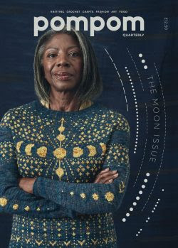
Pom Pom Quarterly Autumn 2018: A Review


In today's post we're going to have a look at Pom Pom Quarterly's Autumn 2018 issue.


Artemis. Not bad. The idea here is that the neckline is supposed to represent the crescent moon, and it is a fun concept. I'd fix the dropped shoulders though.


Ceridwen. I like the stitchwork, but this is terribly unflattering even on a professional model, which never bodes well for the rest of us. This could be reshaped, but honestly it would be easier just to go with another pattern.


Hecate. Pretty, and as much as I like the blue and pale gold colourway, I am enjoying imagining all the other colour schemes this could be made in.


Hypatia. Very attractive in a subtle way. This is one of the more interesting and creative textural effects I've seen in a while, and yet it was done so simply, with just garter and stockinette stitches, and two similar shades of yarn.


Ixchel. This is absolutely fabulous. I've seen a number of moon and stars-themed knits over the years, and it's always a nice theme, but this one is truly out of this world.


Luna. There's some good texture going on here, but the overall effect is so schlumpy.


Moonbow. This isn't so much a sweater as a mutant sofa cushion with sleeves.


Moondust Hat and Moondust Mittens. Nice hat and mitts set.


Sina. I'm not sure about the two moon halves on this one. Sure, it looks kind of cute when the wearer holds her hands together, but when the mittens are separate (as they will be most of the time), they look like two random and pointless half-circles.


Sky Map. I want to like this, but I don't. This wrap looks as though it's been darned, and not particularly well. Maybe I'd like it if the embroidery were better.

Wednesday 13 June 2018

Pom Pom Quarterly Summer 2018: A Review


Pom Pom Quarterly has released its Summer 2018 issue. Let's have a look at it, shall we?


Anni. I like the stitchwork, neckline and sleeve edging, and colour palette, but this cropped boxy shape is going to be unflattering on most women.


Bayadere. The combination of three similarly coloured yarns, thin stripes, and garter stitch ridges on stockinette lend this pullover a surprisingly sophisticated and interesting effect.


Deauville. A simple, wearable, and not uninteresting piece for summer. That may sound like damning with faint praise, but it really isn't. It is so useful to have pieces of clothing that are simple enough to go with lots of other pieces, and yet have little details or design twists that keep them from being bland.


Herrera. I love the fantastic curving central stripe on this top, but I don't love the sad sack shape.


Judoka. This little tote bag is so very clever and visually striking. I suppose it wouldn't hold much, being only knitted and unlined, but it's such a treat to look at I almost don't care. And the styling in this photo is incredible, because the bag is the perfect finishing accessory for that supercute striped dress. If a woman passed me on the street in this smashing outfit I couldn't not notice her. I'd sneak at least several looks at her ensemble, and take mental notes.


Leiden. This isn't bad. I like the overall concept, with its Art Deco feel. I liked it better before I took a close look at it, because the stitchwork looks rough in spots.


Macklin. An understated contemporary wrap.


Nasreen. This one's rather fun in terms of its rhythmic visual curves, but this would likely be a difficult shape to carry off.


Riley. Ooh, nice. I like the subtle effect of the two similar shades and the overall design, with the framing effect created by the change of direction in the front panel. My one nitpick is that I'd neaten up the fit a bit, though this slightly oversized fit is fine too.


Tarmac. The combination of a cream and a charcoal yarn combined with a subtly two-toned I-cord trim is visually appealing, but I can't sign off on the shape of this tank top. It's going to look sloppy and unflattering on most women.


Vasarely. Another attractive contemporary-style wrap.

Monday 19 March 2018

Pom Pom Quarterly Spring 2018: A Review


Pom Pom Quarterly has released its Spring 2018 issue. Let's have a look at it, shall we?


Cablegram. Classic cabled cap.


Carimbo. These mitts are cute and fun. I like the playfulness of the colour scheme and the two patterns.


Durumi. An eye-catching and contemporary reinvention of the classic fair isle.


Perfin. I'm rather liking the stitchwork in this one, but the shape is so terribly frumpy. This sweater looks like it belongs to a landlady who goes about in curlers and run-down slippers, leaves her teeth in the laundry room, and has eight mangy cats and a yappy, randy dog.


Postmark. These socks are super cute!


Tête-Bêche. Very cute hat.


Timbromania. A simple, pretty, and extremely wearable summer top.


Treskilling. I like the delicate, interlacing detail around the neck of this, but not the shaping, which despite the model and photographer's best efforts is so unflattering.


Vaffel. This one doesn't have the greatest shape either, but it's passable.


Vita de Vie. Quite attractive and wearable. The lacy detailing on the front and back is all the interest this pullover needs, and it's well shaped.

Monday 20 November 2017

Pom Pom Quarterly Winter 2017: A Review


Pom Pom Quarterly has released its Winter 2017 issue. Let's have a look at it.


Tabular. I rather like the colourblock yoke detail, but not the cropped length. However, that's easily changed.


Stellate. Very cool, contemporary style wrap.


Selenite. This isn't a bad twist on a simple striped sweater. I'd neaten up the fit a touch.


Orianna. Nice, and rather fresh, combination of fair isle and cables.


Fluorite. I really like these, and yet technically they are almost as simple as socks can be. Reverse stockinette stitch and a range of expertly arranged subtle colours make them very interesting.


Ephemeris. Another very cool shawl with a modern appeal.


Dipyramid. Very catchy graphic effect.


Bindrune. Love the stitchwork on this cardigan, but not its shaping.


Cobaltoan. Love both the brioche and the colour palate used in this hat.


Chrysocolla. A fun and visually interesting mix of cables and bobbles.