Monday, 21 August 2017
Knit Simple Fall 2017: A Review
Knit Simple has released its Fall 2017 issue! Let's have a look at it, shall we?
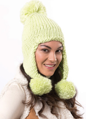
Cute simple cap.
The combination of the colour and the shaping gives the impression that this woman is sporting a particularly friendly squid.
This scarf needs a fringe.
This scarf could also use a fringe.
I like faux fur pom poms, but not on this particular hat and scarf set, which are a little too rough-looking to be a good match for it. This set would have been better served by tassels worked in the same yarn.
Kind of fun for the under 25 set.
Not a bad capelet, for all it's so simple. The shaping is good, there's some texture, and the colour is beautiful.
A very effective tartan check effect, created with just garter stitch.
This one's pretty striking. I'm enjoying imagining all the different colour schemes this could be done in.
This afghan is also nice. I'm liking that the designer used one solid and one variegated yarn, which gives the piece more visual interest than two solids would have.
I quite like the visual effect of loosely interwoven strips, but not the colour scheme.
I don't feel that I can properly assess this one, given that I can't see the front. It's not a bad pullover from what I can tell.
A handsome scarf and cap set.
Very basic socks.
An attractive, classic vest.
The caption above this sweater says, "Flattering silhouettes in wear-with-everything shades." I don't disagree that the colourway is attractively neutral, but that is not a flattering silhouette or shape.
A very decent cabled cardigan.
Not a bad cardigan, but I would fix those dropped shoulders.
This isn't sitting particularly well -- it has a bulky effect.
I quite like this one. The shaping is good and that diagonal cable effect is interesting and effective.
Not bad overall, but I would neaten up the shape a bit.
A nice shawl with some good stitchwork.
An attractive shawl design that deserved to be made with a more attractive yarn.
This striped shawl is pretty and eye-catching.
I'm very much liking this one. It never fails to surprise me how much varying stripe widths can do for a striped pattern's visual interest.
This fluffy heart-shaped pillow would be a cute and useful piece for a child's room.
I like the stripes on this pullover's sleeves, but the heart on the front looks a little too crude. I'd improve the shape of the heart and knit it into the front of the sweater.
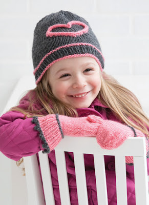
This hat and mittens set isn't quite pulling together. I'd make them both in the same main and contrast colours, put smaller hearts on the back of the mittens, and skip the picot trim on the mitten cuffs.
Cute set. I spent a minute debating whether I might work those hearts into the scarf with intarsia, but the appliqué effect is cute as well.
Friday, 11 August 2017
Cast On Fall 2017: A Review
Cast On magazine has released its Fall 2017 issue. Let's have a look at it, shall we?
A Basket of Posies. Not bad, though with its curling edges and crudely sketched-on flowers, it is a little on the rough and ready side. It's undeniably cute and the butterfly buttons are a nice touch.
A Road Less Travelled. I like this on the whole, but that collar is making me twitchy. It's supposed to be asymmetrical, but it looks merely askew.
A-Tisket, A-Tasket socks. Quite a good-looking pair of socks.
Alpine Hiking Vest. I like this piece, though I do note that the empire-waist level band won't flatter the well-endowed woman. If this vest is for a woman who requires anything larger than a B-cup, move that band down to her waist.
Baby in Basket Hat. At first glance, I thought this was some kind of little drawstring bag. It's not a bad little hat.
Color Block Tunic. I like the basic concept of a colour block tunic, but the execution didn't quite pan out. The look is too visually fragmented.
Diagonal Basketweave Cowl. A useful piece with some textural detail to keep things interesting.
English Diamonds Cowl. Pretty.
Garter Stitch Basketweave. A nice simple throw cushion.
Golden Aspen Texting Gloves. Fingerless gloves usually have a bit more finger showing than this, and the effect is a bit weird, as though the finger tips are showing because the glove fingers blew out at the tips rather than by design.
Green Aspen Arm Warmers. I'm liking these.
Hit the Road Cardigan. Oh, I like this one! Shaping and detailing are good, and those curving front basket stitch panels give the sweater visually flattering lines.
Mosaic and Slip Stitch Basketweave Pillow. That pattern has a smart visual effect.
Mr. Liss. This is supposed to be a fox, but it actually looks more like some sort of fox/anteater hybrid. Foxes' noses aren't that long.
Napoleon + Deseret Jacket. This is the cover look, and deservedly so, because that stitchwork is fabulous. It's impossible to add waist-shaping to a design like this one, but it would be possible to fix the dropped shoulders and make the sleeves neater fitting.
Orange Sassafras Texting Gloves. Here we have a little more fingertip showing, but also bunched up knitting because, I suspect, the fingers were simply too long for the model's hand. This one has a bit of pattern on the back, but it's not especially effective.
Picot Edge Table Runner. Not a bad decorative piece.
Red Maple Texting Gloves. These are just like the Golden Aspen Texting Gloves, only done in a light fingering yarn rather than in sport weight. I like the more polished look of the lighter yarn. I never like my gloves to look or feel like oven mitts.
Rib and Garterweave Pillow. This is a slight variation on the Garter Stitch Basketweave pillow above. I think I prefer the other one, because the smaller scale of the pattern gives the pillow a slightly more polished look.
Roaming Check Boot Cuffs. I can only sign off on boot cuffs when they can pass for the top of the boot. These don't.
Top-Down Market Bag. This is going to stretch all to hell as soon as one puts one's groceries in it.
Wayfarer. This has a dated, frumpy look, and zip fronts look bad when folded back so that the inner edge of the zipper can be seen, as here.
Zick Zack Fingerless Mitts. Quite like these, which are well-shaped and have a pretty colourway.
Wednesday, 9 August 2017
Interweave Knits Fall 2017: A Review
Interweave Knits has released its Fall 2017 issue. Let's have a look at it.
All Who Wander Cowl. Lovely. The pattern is very attractive, and I'm also enjoying the offbeat colourway.
Angelina Pullover. The yoke is good, but that is one unflattering shape.
Astral Road Ruana. That cape is one beautiful piece of work, but I can't help feeling it would show to better advantage on a couch.
Cash Pullover. Nice piece. The cabling has an Art Deco feel.
Free Falling Pullover. A very decent piece, but I can't help feeling that it needed a more finished-looking neckline.
Gold Rush Shawl. What an exquisite piece of lace.
Goldsmobile Top. This isn't such a badly designed piece -- the cables and shaping are good -- but I can't get past the thought that a heavy, turtlenecked vest isn't a concept that makes much sense.
Hank's Pullover. A very decent, wearable piece.
Highway 61 Pullover. A classic piece, though I have my reservations about the fit through the lower body -- it looks too loose and floppy in several of the pictures.
Madame George Pullover. Nice wearable piece with some textured stitchwork to keep the look interesting.
Nelson Pullover. Love this one, which perfectly integrates contemporary (the drawstring neckline) and classic (the cables) details in an attractive, wearable piece.
Prairie Wind Cardigan. I'm liking the fair isle and the hood, but that is one dowdy shape.
Subterraneans Cardigan. Beautiful, classic cardigan... that deserved better than this "sister wife" styling.


Tangled up in Gray Pullover. Nice! I especially like the back detail.
Whiskey Creek Pullover. This one isn't bad -- the shape is excellent and the shawl collar sits perfectly -- but I think it needed something a little more, like a marled effect in the reverse stockinette stitch panel.
Whitman Hat. Cute and rather eye-catching cap.
Subscribe to:
Posts (Atom)


