Showing posts with label Bergère de France. Show all posts

Monday 18 January 2016

Bergère de France Magazine 181: A Review, Part 1


Bergère de France has released its Magazine 181. Actually, they've released Magazine 182 and Magazine 183 as well. Malheureusement, I've let myself get behind on Bergère de France reviews, but I will be catching up in the next few weeks. Since there are 46 patterns in this issue, this post constitutes the first half of the review of Magazine 181. Part two will be released on Wednesday.


Pattern #1, Round Neck Fair Isle Sweater. This is not a fair isle sweater. This is a bar code sweater. However, it's not an unattractive or an unappealing bar code sweater, provided that you don't mind grocery store cashiers absentmindedly scanning it when you're checking out your groceries.


Pattern #2, Roll-Neck Sweater. This is simple but smart and attractive enough.


Pattern #3, Sweater with an Embroidered Collar. Oh, Bergère de France, sometimes you just don't even try, do you? When I saw this sweater in thumbnail I thought I was going to like it, because I assumed the collar had an interesting embroidered design and that the ribbon detail on the back was intarsia. Then I clicked. Turns out that's an actual ribbon, and I don't know why anyone would embroider the name of her sweater's colour on her collar. Is the idea that we will sometimes forget the word "black" and consequently will need to be able to rush frantically to the nearest mirror to painstakingly read the reverse image of the letters? If I were to make anything like this sweater, I'd be making it according to my initial assumptions on its details.


Pattern #4, Roll-Neck Sweater. This is a perfectly nice basic sweater, but unless you're surrounded by very high maintenance colour blind people who demand that you keep them posted as to the colour of your clothing, I see no reason why you'd embroider the name of your sweater's colour on your sweater.


Pattern #5, Cardigan. Frumpy.


Pattern #6, Tasselled Cheich Scarf. I rather like this one, though I think there are much better colourways for it.


Pattern #7, Short Sleeve Sweater. I think the idea here is to distract people from asking how the wearer's new anti-depressant dosage is working out for her.


Pattern #8, Hooded Sweater. I feel like I'm watching this nice hoodie get assaulted, with the green patches representing duct tape and those letters reading as a partially smothered cry for help.


Pattern #9, Hooded Sweater. Adding weird embellishments to a basic item does not a interesting sweater design make.


Pattern #10, Striped Sweater. This looks like something made by a involuntarily committed psychiatric patient during her supervised crafting time. During her unsupervised crafting time, she is making a ladder out of bedsheets.


Pattern #11, Bobble Scarf. The bedsheet ladder took longer than expected, so our crafty psychiatric patient also made herself a scarf to go with her freedom sweater.


Pattern #12, Roll-Neck Striped Sweater. This is the sweater our young pyschiatric patient whipped up to convince the hospital staff that she should be allowed to take two craft therapy classes rather than one craft therapy class and one music therapy class. One of the nurses, who reads this blog, told her that it was rather a nice sweater but that she might consider nixing the music notes and continuing the navy stripes onto the contrast yoke.


Pattern #13, Hooded Sailor Sweater. Omit that tacky pocket and this is a decent piece.


Pattern #14, Hooded Jacket. Not a bad jacket, but the studded heart on the back is too twee.


Pattern #15, Short Sleeve Sweater. This time a designer tried to turn a poorly shaped sweater into a good design by tacking all sort of random crap all over it. And we're also back to the colour designation thing.


Pattern #16, Roll-Edge Heart Sweater. This description refers to French flag heart on this item as "fair isle". I think the writer for the Bergère de France has mistaken the term for "fair isle" for "intarsia". It's not a bad simple design, though I would go with a black or a pale blue or some other than colour than purple for the main colour.


Pattern #17, Roll-Neck Raglan Sweater. The concept of appliqued commercially made patches isn't a bad one at all and this looks rather sporty, though I still think this sweater could have done without the embroidered "REO" on the arm. ETA: I could also do without the embroidered "RED" on the arm. We're not a bunch of five-year-olds, Bergère de France. We know our colours.


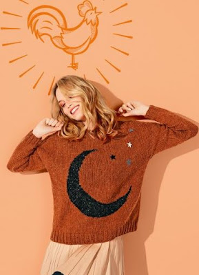
Pattern #18, Round Neck Fair Isle Moon Sweater. This isn't bad, though I would neaten up the fit a bit, and be sure not to disgrace myself among other knitters by referring to the finished item as fair isle, regardless of how Bergère de France may have labelled it.


Pattern #19, Short Sleeve Sweater. Is the Bergère de France design team just getting drunk, putting glue on random notions and hurling them across their atelier at the garments they've produced to see wherever they'll stick? Because I can't think of any other reason to attach a non-functional zipper to a sweater in this fashion. The silver cabochons on the sweater at least make some sense and look reasonably attractive, and the knitted item itself is fine.


Pattern #20, Sleeveless Sweater. This is unflattering as is, but shortening the length and adding some waist shaping would turn it into a decent basic piece.


Pattern #21, Poncho. For those nippy days when you want a poncho that's large enough for both you and the horse you rode in on. I do quite like the stripes, and for a poncho, it isn't badly shaped, but good heavens is this piece huge.


Patterns #22, 23 & 24, Man's Zipped Balaclava. The description for this design claims that it is "perfect for beginners and anyone who loves beautiful materials" and that the "purely decorative fastening adds a little touch of extra chic". Oh, Bergère de France, now you're just fucking with us, aren't you? When this magazine issue was being put to bed, your design team toasted each other with champagne and cackled that it would be such fun to see how far the rest of the world trusted the French reputation for chicness and whether anyone actually made and wore this merde.

Friday 30 October 2015

Bergère de France 180: A Review, part deux


Let's have a look at the second half of the patterns in Bergère de France 180, the first part of the review having been posted this past Wednesday.


Pattern #21, Striped Beanie. Basic hat. The yarn choice works pretty well with it.


Pattern #22, Snood. Another very simple pattern.


Pattern #23, Fair Isle Beanie. Fairly effective stitchwork on this.


Pattern #24, Cape. 'Tis the season not to dress your child in a Christmas tree skirt. Actually, why don't we keep the spirit of that season all year round and avoid the whole night visits from the three ghosts of hideous capes fiasco, especially when the Ghost of Hideous Capes Past is going to be wearing something from the 1970s that reeks of mildew and pot?


Pattern #25, Roll Edge Sweater. Another basic pattern, but this is something that most young boys would find quite unobjectionable.


Pattern #26, Fingerless Gloves. Er, people will pay money for a "design" that required this little effort? It makes you think.


Pattern #27, Fair Isle Bobble Beanie. I rather like this one. The colour scheme really pops.


Pattern #28, Beanie. There are way cuter and better designed hats out there than this low level effort.


Pattern #29, Three Tone Bobble Beanie. Fairly simple piece but the right colour scheme (which this one is not) could make it look rather cute.


Pattern #30, Snood and Bracelet. If you're not going to put more effort into making your child's accessories than this, just take her to Claire's.


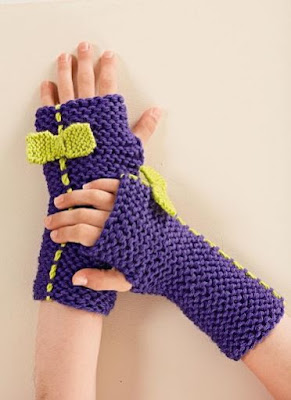
Pattern #31, Fingerless Gloves. These do have some slight appeal, though they still look rather slapped together and crude.


Pattern #32, Legwarmers. For the parents who feel their daughter isn't getting enough of that character-building bullying. I'm glad this child model's face doesn't show in any of the legwarmer shots. Even her feet look embarrassed.


Pattern #33, Large Snood. This is rather appealing. The stripes and the colour scheme are effective. I think I'd leave the tassels off if it were intended for a boy, though.


Pattern #34, Slippers. These don't look too bad overall but that is one ridiculous way of constructing the anklet. Those flaps on the front look like envelopes and remind me of Mark Twain's epigram, "Why do you sit there like a letter with no address?"


Pattern #35, Cable Cover. Er, no. I'm not even sure encasing electrical cords in yarn is safe.


Pattern #36, Fancy Rib Cushion Cover. Not a bad-looking simple stitch, but you probably don't need a pattern for it.


Pattern #37, Garter Stitch Cushion Cover, and Pattern #38, Seed Stitch Cushion Cover. And you definitely do not need a pattern for these.


Pattern #39, Panda Sweater. You've got to give Bergère de France some credit for trying to give a panda sweater some edge.


Pattern #40, Stag's Head Sweater. I would have named this pattern the Mutant Alien Head Sweater.

Wednesday 28 October 2015

Bergère de France 180: A Review, part un


Bergère de France has released issue number 180, which is a collection of fall and winter designs for children aged 2 to 12. Let's have a look at the first twenty patterns in it, shall we? Part deux of the review will be posted this Friday.


Pattern #1, Bodywarmer. Just to remind everyone, bathmats belong on the bathroom floor, not on your child.


Pattern #2, Sweater with Yoke. This is nice on the whole, though that yoke does look more than a little like a braided rag rug.


Pattern #3, Button-Neck Sweater. Decent basic design.


Pattern #4, Long Sweater. Nice texture on this one, and it would look cute over a pair of leggings.


Pattern #5, High Neck Sweater. This is a very decent piece of graphic design, and the idea of pulling out an accent colour with matching buttons is a nice idea.


Pattern #6, Fair Isle Hoodie. Not a bad look, though the fair isle pattern looks like a hieroglyphics version of the Rorschach ink blot test. I see palm trees and pyramids. What do you see in that pattern?


Pattern #7, Shawl Collar Jacket. Nice classic jacket.


Pattern #8, Sleeveless Bodywarmer. Rather a cute little jacket. I'd refine the shape of it somewhat, though. I don't like fitted clothes on children, but I also don't see the appeal of dressing kids in trapezoids.


Pattern #9, Sweater with Fair Isle Collar. Really like the added touch of a fair isle collar and pocket on this otherwise plain sweater. It's really quite an original look.


Pattern #10, Loose Fit Hoodie. I think most kids would find this so large and heavy as to be cumbersome.


Pattern #11, Furry Look Jacket. Again, people, friends don't let friends dress their children in bathmats.


Pattern #12, High Neck Collar. There are better designed cowls than this one.


Pattern #13, Short Sleeved Tunic. I can't say I've ever liked the short-sleeved sweater over a long-sleeved top look, and yet one wouldn't dress a child in a sweater this warm and leave her arms bare. I'd make this one with long sleeves.


Pattern #14, Hooded Jacket. Not a bad jacket, though those pockets look a little off. I think the problem is that they need to be a few inches bigger to make them proportional to the rest of the item.


Pattern #15, Cardigan. This one's rather too blah and featureless. Making it in a brighter, more attractive colour would help a lot.


Pattern #16, Hooded Coat. I like this coat, but I don't like the tassels on it. A more interesting button choice would be a better way to step up the look a little.


Pattern #17, Shawl Collar Herringbone Sweater. Nice piece.


Pattern #18, Jacket with Removable Hood. Not a bad look. It has something of the classic pea coat's appeal.


Pattern #19, Fair Isle Bobble Beanie. Nice simple little hat.


Pattern #20, Fair Isle Sweater. Interesting varied pattern on this, though it does deserve a more interesting colourway.